
I love a home that surprises you the second you step through the door, and this pale butter yellow accessible container home absolutely does that. From the outside, it feels cheerful and grounded, with a soft sunny finish that takes the industrial edge off the container structure and makes the whole place feel welcoming instead of stark. Set up to feel easy, open, and beautifully navigable, it balances modern lines with a warmth that I think a lot of people are craving right now.
Inside, the mood shifts into something even better: calm, bright, and incredibly thoughtful, with every finish working hard without looking fussy. As a concept design, it still feels very livable to me because the beauty is tied so closely to function, from the wider passages to the seamless transitions between rooms. It has that rare quality of being practical enough for everyday life while still giving you that little wow moment in every space.
Exterior
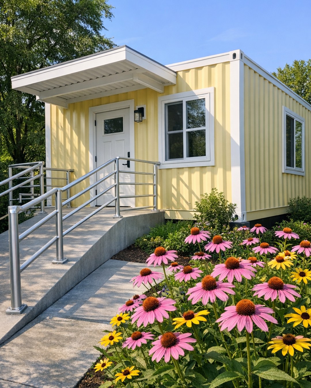
The exterior keeps the recognizable geometry of a container home, but the pale butter yellow paint softens every line and gives it a fresh, optimistic personality. I can picture this color looking especially pretty in morning light, when it would read almost creamy, and then turning a little richer by late afternoon. Clean black window frames add contrast, while a gently sloped entry path and integrated platform porch make the front approach feel intentional, graceful, and easy to use.
What stands out most to me is how accessibility is folded right into the architecture instead of being treated like an afterthought. The entry sequence is broad and level, the overhang provides weather protection, and the landscaping stays simple and tidy with low grasses, gravel, and raised planters that don’t clutter the route in. It feels contemporary but friendly, and that is a combination I always notice because it is much harder to pull off than it looks.
Living Room
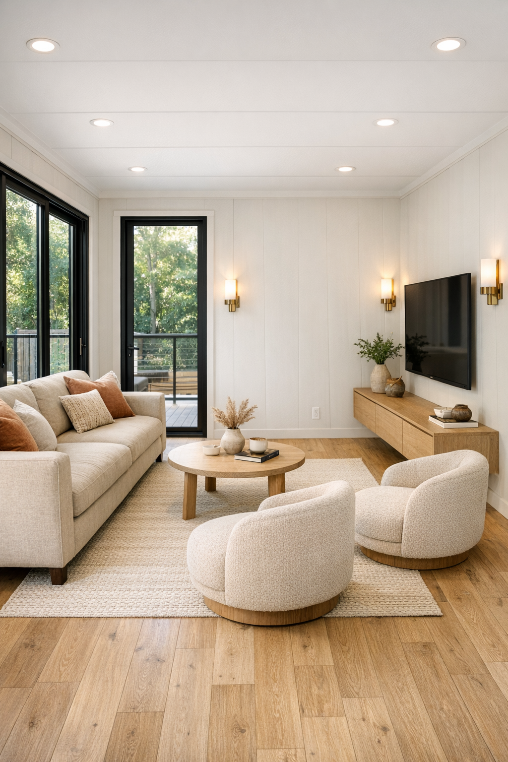
The living room leans into openness in a way that makes the footprint feel larger than you would expect, with generous clearance around furniture and a layout that never forces tight turns or awkward circulation. A low-profile sofa in warm oatmeal linen anchors the space, paired with two rounded accent chairs in a soft clay-tan fabric that add shape without visual heaviness. Underfoot, a flatwoven rug in cream and muted honey ties everything back to the exterior color palette, while pale oak flooring keeps the room light and cohesive.
I especially like the way the lighting is handled here. Instead of one dramatic fixture, the room uses layered illumination: recessed ceiling lights for even brightness, a large paper-shaded floor lamp for softness, and wall sconces in brushed brass that add a subtle glow in the evening. The coffee table has softened corners, the media console floats to keep the floor line open, and the window treatments are simple woven shades with linen drapery panels that bring texture without fuss. It feels like the kind of room where you could read, host friends, or collapse after work with takeout and still feel like you have your life together.
Dining Room
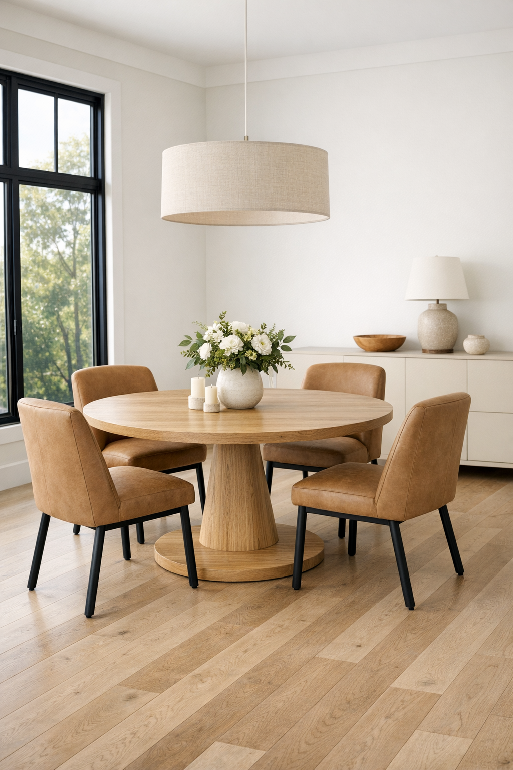
The dining area is compact but very well resolved, which honestly is my favorite kind of design move. Instead of squeezing in something oversized, the space centers on a round pedestal table in light oak that allows for easier movement all around it, with four upholstered dining chairs in a soft camel performance fabric. The curves matter here; they visually relax the room and make the circulation feel smoother, which is both beautiful and practical.
Above the table, a simple linen drum pendant brings a gentle, diffused light that keeps the room feeling intimate without becoming heavy. One wall holds a shallow sideboard in a creamy matte finish for serving pieces and daily storage, and I can easily imagine this being the spot where weekday breakfasts, rushed coffee refills, and weekend pasta dinners all happen. There is enough polish to make it feel special, but nothing is so delicate that you would be nervous to actually use it.
Kitchen
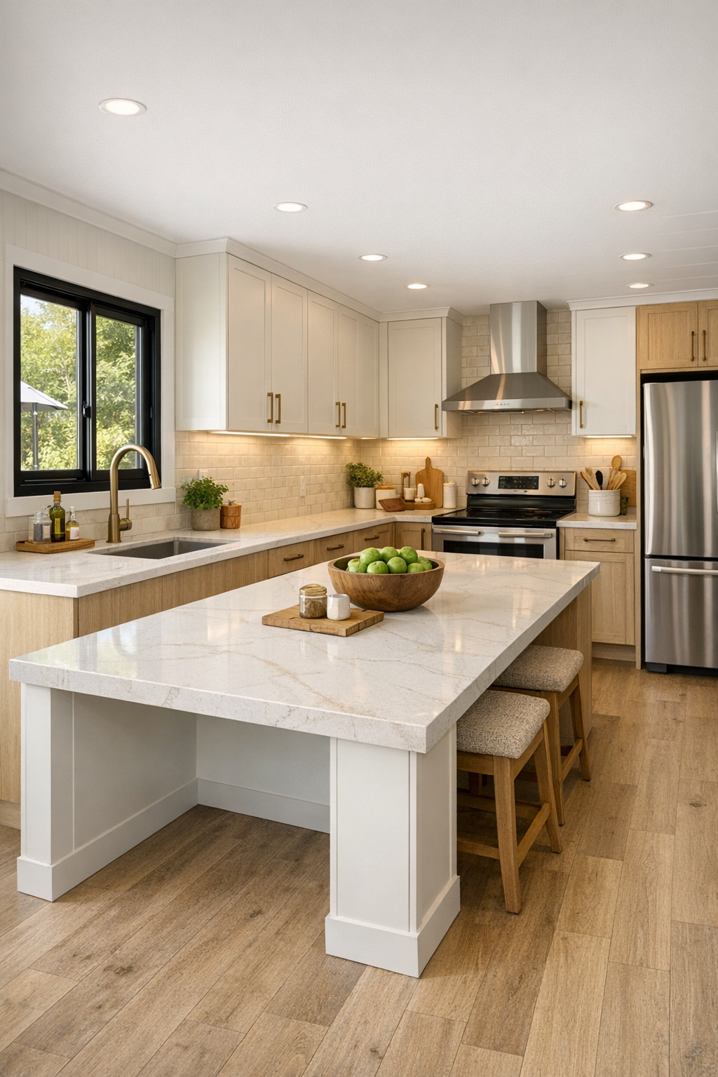
As someone who is always thinking about how a kitchen works on a busy Tuesday, this one really gets me. The layout is clean and efficient, with wide passageways, easy reach zones, and a large central island that doubles as prep space, casual dining, and the social hub of the house. The cabinetry is a mix of warm white and pale wood, finished with slim hardware in a muted brass tone, while the counters are a durable quartz with soft beige veining that brightens the room without looking too glossy or precious.
What makes it especially compelling is the way the practical details are integrated so gracefully. There are deep drawers instead of too many upper cabinets, under-cabinet lighting for task work, and open shelving used sparingly for everyday dishes and a few ceramic pieces. The backsplash is a handmade-look tile in a creamy off-white that adds just enough texture, and the appliances are sleek but not flashy. I can already picture meal prep here: chopped vegetables lined up on the island, soup simmering on the range, and enough room for somebody else to help without everyone bumping elbows.
Bedroom
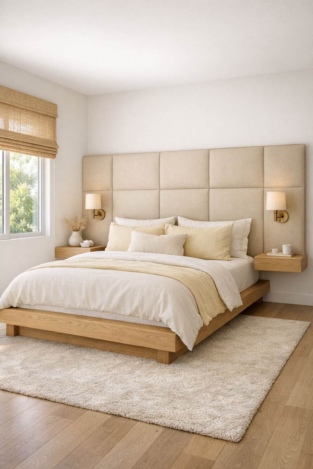
The bedroom pulls back on contrast and lets softness do most of the work, which feels exactly right. A low platform bed in light wood sits against a padded headboard wall in a sandy beige textile, and the bedding layers whites, buttercream, and warm taupe for a look that feels restful without becoming bland. There is plenty of clear floor space around the bed, and the furniture stays streamlined, with floating nightstands and a tall storage piece that keeps the room functional while preserving openness.
I also love the quieter textures here: a nubby wool throw, woven blackout shades, and a large area rug with a subtle tonal pattern that adds comfort underfoot. The lighting comes from small articulating sconces and a gentle ceiling fixture that keeps the whole room evenly lit. It is not a bedroom trying to be dramatic; it is a bedroom trying to make your mornings easier and your evenings calmer, and honestly, that tends to age much better.
Bathroom
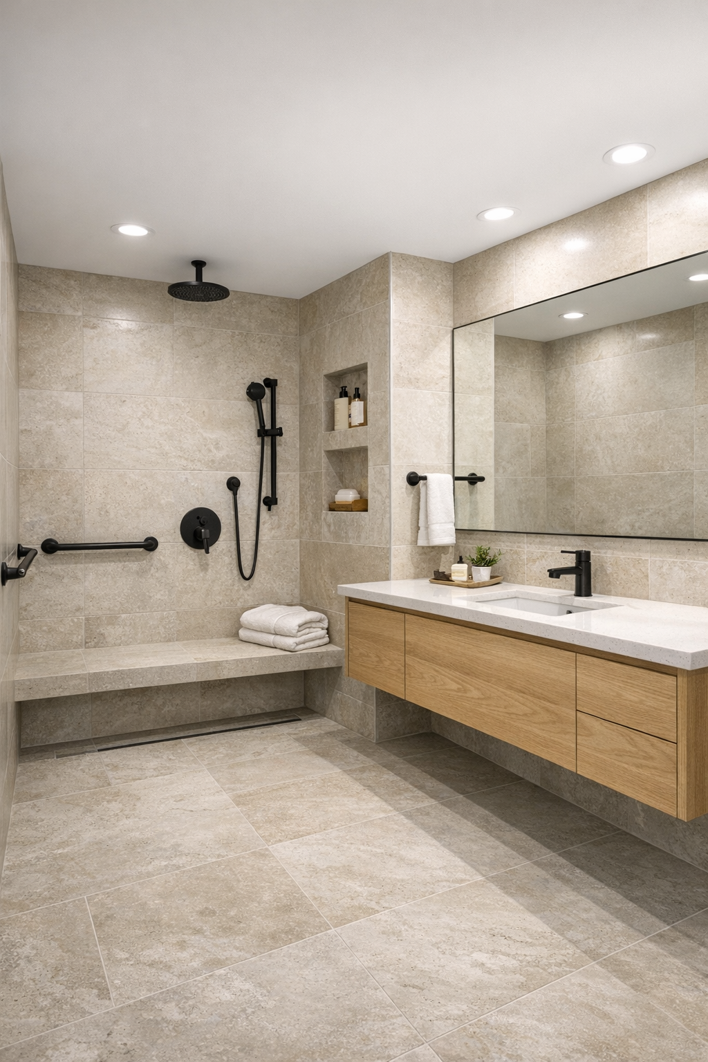
The bathroom might be one of the best examples of how this home blends comfort and usability. It is finished in large-format porcelain tile in a soft limestone tone, which helps the room feel seamless and easy to maintain, and the curbless shower keeps everything visually open. A floating vanity in pale oak adds warmth against the cleaner surfaces, while a quartz countertop and integrated sink keep the lines simple and uncluttered.
There is a real spa-like calm here, but it is grounded in smart choices. The mirror is broad and well lit, the shower includes a built-in bench and handheld fixture, and the storage is tucked into recessed niches and vanity drawers rather than bulky cabinets. Matte black fittings give the room a crisp outline against the lighter palette, and fluffy white towels plus a small stool in natural wood soften the look. It feels composed, serene, and genuinely usable every day.
Other Areas
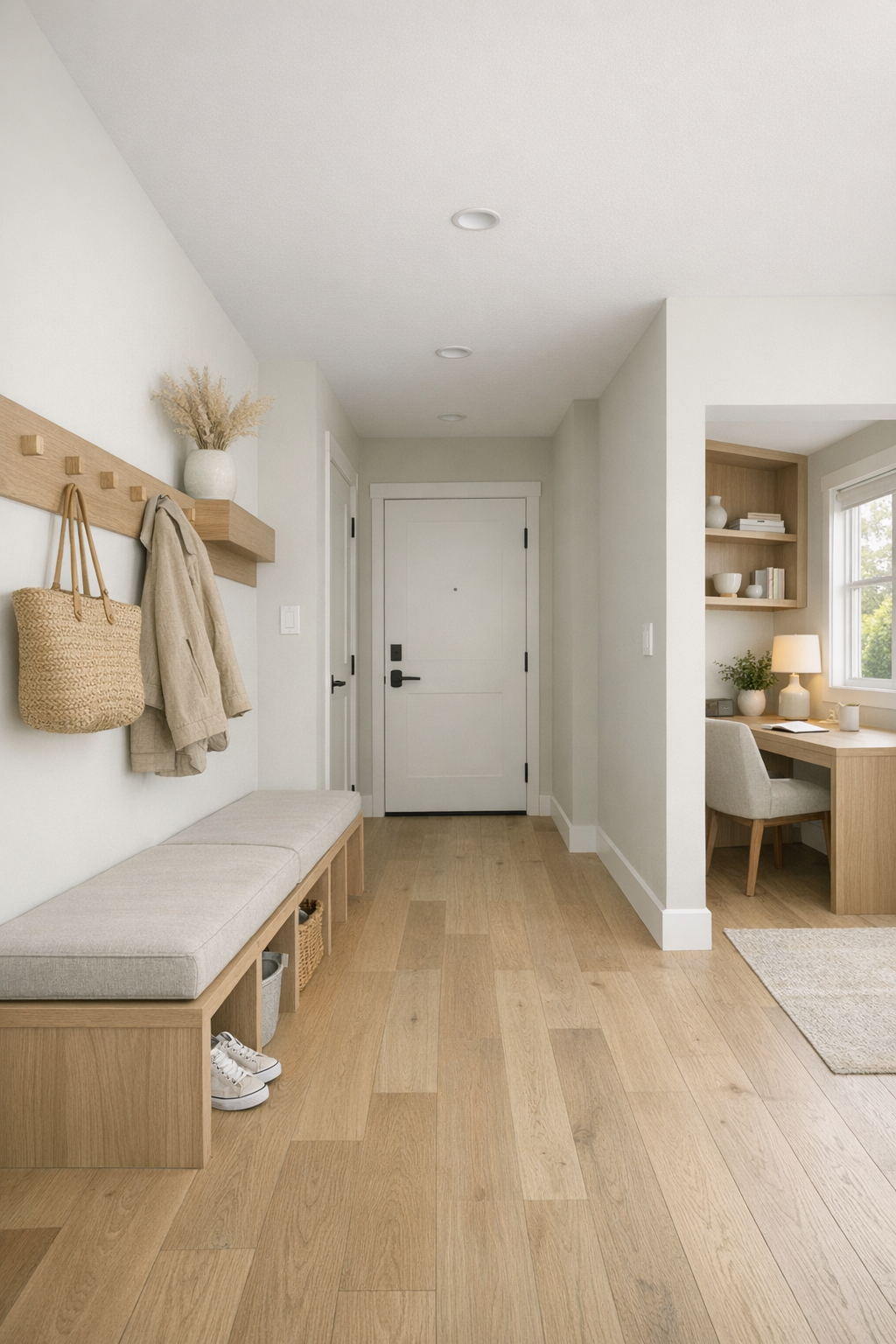
The circulation spaces, entry zone, and utility moments are handled with the same care as the main rooms, and that always tells me a design is truly thought through. The hallway is wide and bright rather than treated like dead space, with pale walls, flush transitions, and a few framed textiles adding softness without clutter. Near the entry, there is a built-in bench and storage wall in light oak that gives you a practical landing spot for coats, bags, and shoes, which I know I would appreciate every single day.
Even the work nook and laundry area feel intentional instead of leftover. A compact desk with open leg room sits beside a window for natural light, and the laundry storage uses vertical cabinetry in the same warm palette as the kitchen so the whole home feels connected. These in-between spaces are often where daily life either flows or falls apart, and here they clearly support routines in a way that feels calm, flexible, and very real.
Why You'd Live Here
This home makes a strong case for beauty that actually supports real life. The accessible planning is integrated so naturally that it improves the flow for everyone, and the pale butter yellow exterior gives the whole place a personality that feels uplifting without being loud. Inside, every room is warm, edited, and easy to imagine using, which is probably why I kept mentally moving myself in while writing this.
For me, the biggest success is that it never asks you to choose between style and practicality. You get smart circulation, durable finishes, comfortable textures, and a light-filled atmosphere that would make everyday routines feel a little easier. Whether you love good design, need a more navigable layout, or just want a home that feels cheerful and calm the minute you walk in, this one really delivers.