
This tiny home leans into a soft putty palette in a way that feels calm, grown-up, and surprisingly expansive. From the outside, it has that clean, modern cottage character I always gravitate toward, but inside, the design becomes much more layered: pale oak, matte plaster, brushed metal, and gentle curves all working together to make a compact footprint feel beautifully intentional. Set up to be accessible without looking clinical, it has the kind of easy flow that makes daily routines feel lighter.
What really won me over is how every inch seems to do two jobs at once while still feeling warm and unfussy, which is not easy to pull off in a small home. Even as a concept design, it feels completely livable to me, especially as someone who is always thinking about how a space supports real life, from carrying groceries in one trip to making dinner on a busy weeknight. This one manages to be practical and serene at the same time, and that balance is what makes it special.
Exterior
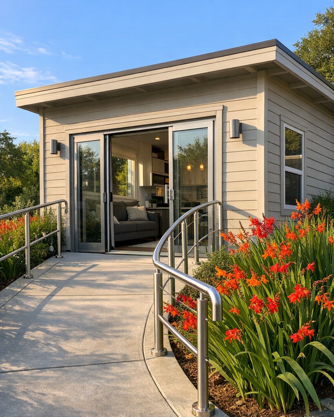
The exterior is understated in the best way, wrapped in a putty-toned cladding that shifts softly depending on the light. Instead of relying on contrast for drama, the design uses texture and proportion: slim vertical siding, a low-sloped roofline, black-framed windows, and a sheltered entry that feels welcoming without adding bulk. I love how the muted color gives the home a grounded, almost velvety presence in the landscape, making it feel connected to stone, gravel, and dry grasses rather than standing apart from them.
Accessibility is folded seamlessly into the architecture. The approach appears gently graded rather than sharply ramped, and the entry threshold looks flush, which immediately changes the feeling of arrival from “accommodation” to simple ease. A small deck or landing broadens the front edge of the home, creating space to pause, set down bags, or greet a neighbor, and the overall silhouette stays crisp and minimal without ever feeling stark.
Living Room
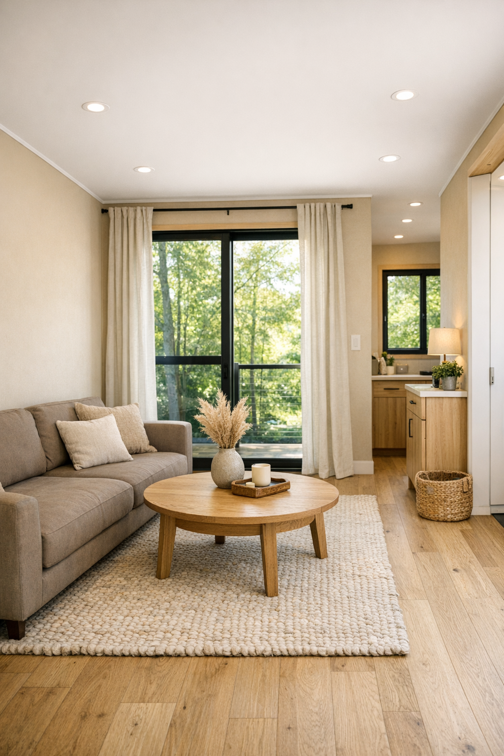
The living room is where the putty palette really shows off its range. Walls in a warm stone-beige meet pale wood flooring and a slightly deeper taupe sofa, creating a layered neutral scheme that feels soft rather than flat. I picture a low-profile sectional with squared cushions, a rounded oak coffee table, and a woven wool rug underfoot to add a little grip and texture. The layout stays open for circulation, but the furniture placement still creates a cozy zone that invites you to settle in with coffee, a laptop, or a favorite show at the end of the day.
Lighting does a lot of quiet work here. Instead of one central fixture dominating the room, I imagine recessed ceiling lights, a slim wall sconce near a reading chair, and daylight pouring in from generously sized windows that sit low enough to keep the room connected to the outdoors. The edges are softened with linen drapery, a boucle accent chair, and maybe one ceramic side table with a matte finish. It feels edited but not precious, which is honestly my favorite combination in a small home.
Dining Room
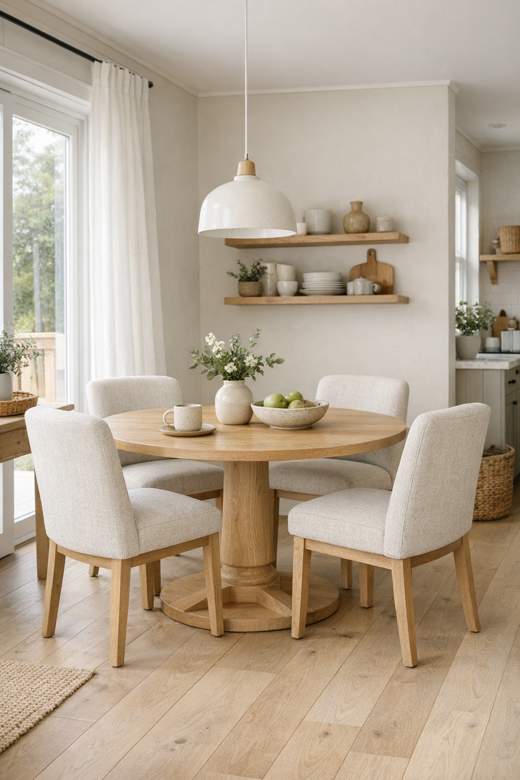
In a home this size, the dining area has to be more than a place to eat, and this one feels ready for that. I can see a compact round pedestal table in light oak, which is always a smart move because it softens corners and makes movement easier. The chairs would likely be fully upholstered in a durable oatmeal fabric, comfortable enough for lingering over dinner but streamlined enough not to crowd the room. Everything about it suggests flexibility, whether it is used for breakfast, a quick work session, or my favorite kind of Sunday meal prep with vegetables spread out everywhere.
The finishes stay cohesive with the rest of the home, but I like the idea of a slightly richer accent here, maybe a smoky ceramic pendant overhead or a deeper mushroom-toned built-in bench nearby. That subtle shift gives the dining area its own identity without breaking the flow. The scale is careful, the sightlines stay open, and the room feels bright and breathable, which is exactly what a small dining space needs in order to feel inviting instead of squeezed in.
Kitchen
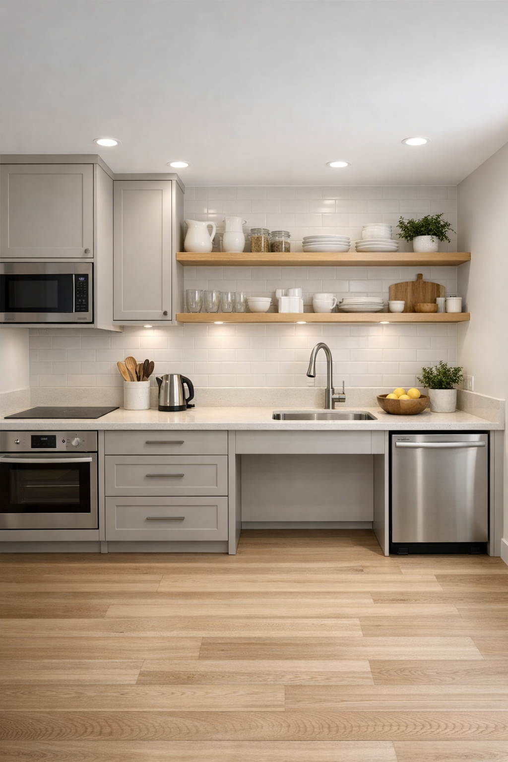
The kitchen might be my favorite part because it treats accessibility and beauty as the same design goal. The cabinetry in a soft putty or mushroom matte finish blends right into the architecture, while slim pulls in brushed nickel or champagne bronze add just enough definition. I imagine wide drawers instead of hard-to-reach lower cabinets, open knee space at one section of the counter, and a single-level work surface that makes prep feel straightforward. As someone who cooks a lot, I notice when a kitchen seems designed for actual movement, and this one does.
The material mix keeps it elevated without making it fussy: a creamy quartz countertop with very light veining, a full-height backsplash in the same slab or a limewashed tile, and warm wood shelving for dishes and everyday essentials. Under-cabinet lighting would brighten task zones, while an induction cooktop and integrated appliances help preserve that seamless look. It feels like the kind of kitchen where you could chop vegetables, answer emails, and still keep the counters looking calm, which to me is basically the dream.
Bedroom
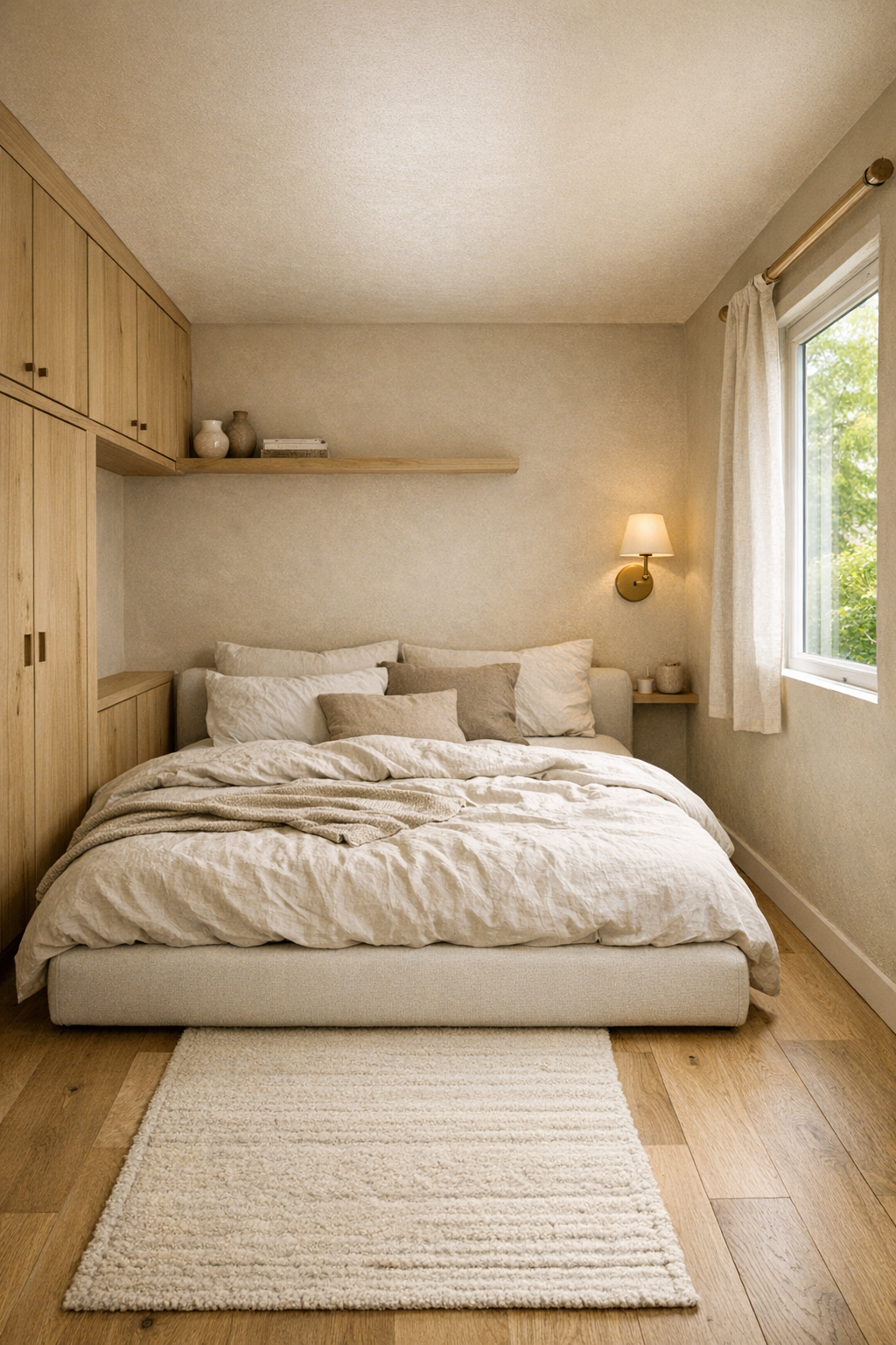
The bedroom proves that a tiny home does not have to sacrifice softness. Instead of trying to cram in too much furniture, the design seems to focus on generous circulation and built-ins that keep the room restful. A low bed with an upholstered headboard in flax or sand tones would sit against a putty backdrop, with floating night shelves rather than bulky tables. The bedding is where I would add a little texture, maybe washed linen, a quilted coverlet, and one knit throw to make the room feel layered without feeling busy.
I also love the possibility of integrated storage here, especially full-height cabinetry that blends into the wall finish and keeps visual clutter down. Natural light would be essential, and a window placed for privacy but still generous enough to brighten the space would make the room feel open in the morning. Add in blackout drapery, a small reading sconce, and maybe a soft wool runner beside the bed, and it becomes the kind of bedroom that feels genuinely restorative rather than simply efficient.
Bathroom
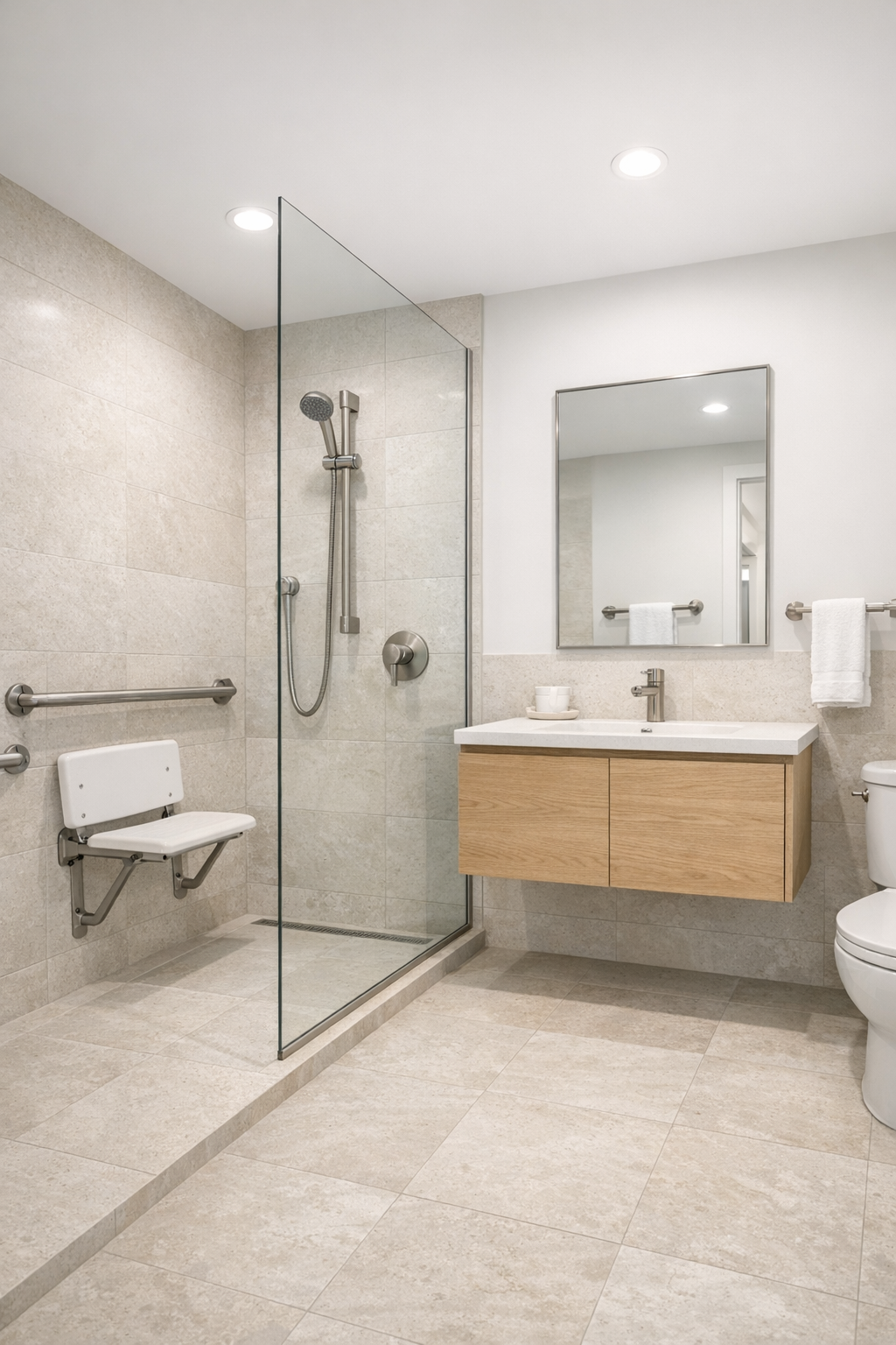
The bathroom carries the same quiet palette but introduces more contrast through finish and shape. I picture large-format porcelain tile in a pale limestone tone, a floating vanity in white oak, and a solid-surface countertop with a softly rounded sink. Accessibility here feels especially well considered, with a curbless shower, a handheld shower fixture, and enough maneuvering space that the room never feels pinched. The best accessible bathrooms always feel spa-like to me when they are done well, and this one definitely does.
What keeps it from feeling cold is the texture. Matte tile, brushed metal fittings, plush towels, and maybe a ribbed glass sconce or mirror detail give the room depth without visual noise. A recessed niche in the shower keeps products tidy, and a frameless glass panel preserves the openness of the layout. It is a compact bathroom, but it feels polished and peaceful, the sort of space that would make even a rushed weekday morning feel a little more organized.
Other Areas
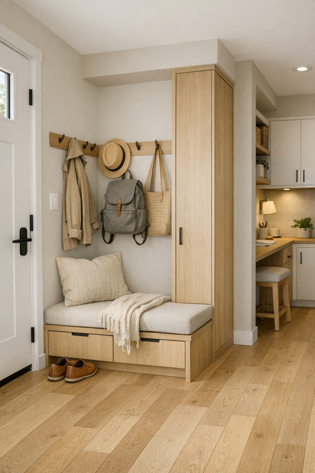
The supporting spaces are where this home’s thoughtfulness really comes through. An entry nook with a built-in bench, hooks, and concealed storage would make daily comings and goings so much easier, especially in a tiny footprint where clutter can spread fast. I can also imagine a slim hallway with continuous flooring and flush transitions, plus a pocket door or two to save swing space. These are the kinds of decisions that may not be flashy in photos, but in real life they make a home feel effortless.
If there is a small loft alternative, office corner, or laundry cabinet tucked into the plan, I suspect it would follow the same rules as the rest of the house: integrated, tonal, and highly functional. Even a compact workspace could feel inviting with a built-in desk in pale wood, open shelving, and a nearby window. Nothing feels random here, and that is what gives the whole interior its sense of calm. Every surface, opening, and storage moment seems to have been considered with daily rhythm in mind.
Why You'd Live Here
You would live here because it shows that small-scale, accessible design can still feel incredibly refined. Nothing about the home reads as compromised; it feels edited, smart, and genuinely comfortable. I think that is why it sticks with me. It is not just attractive in photos, it seems set up for the rhythms of everyday life, with circulation that makes sense, storage where you need it, and materials that would wear beautifully over time.
More than that, this tiny home understands that calm is a design feature. The putty palette, soft textures, and warm woods create a backdrop that feels steady and restorative, while the accessible planning makes the space usable in a way that is both visible and graceful. For anyone craving a home that is simpler without feeling stripped down, this one makes a very convincing case.