
I’m always intrigued by homes that take a practical building type and soften it into something warm, livable, and unexpectedly elegant, and this pale almond container home does exactly that. Set against a calm, open landscape, it balances the crisp geometry of stacked steel modules with a creamy exterior tone that feels almost edible—like blanched almond with a touch of oat. The result is modern without being cold, streamlined without feeling severe, and immediately inviting in a way many industrial-inspired homes never quite achieve.
What makes this place special is how thoughtfully the design translates the container shell into rooms that feel layered, gracious, and deeply comfortable; even as a concept design, it reads with the kind of spatial clarity I’d want in a real daily routine. There’s a quiet confidence here in the restrained palette, the natural finishes, and the way light is used to soften every edge. As I moved through it in my mind, I kept noticing how the home holds onto its architectural honesty while making space for ease, beauty, and the small rituals that make a house feel personal.
Exterior
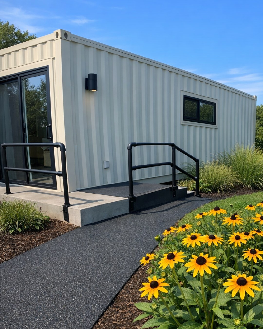
The exterior is all about contrast handled with restraint. The container structure remains legible in its long horizontal lines and stacked proportions, but the pale almond finish completely changes the tone, muting the usual utilitarian edge and giving the home a chalky, sun-washed softness. Slim black window frames sharpen the composition, while sections of warm natural wood at soffits, entry recesses, and terrace walls add the sort of visual seasoning I always appreciate in a simple design—it’s like a pinch of salt in a good dish, not overpowering, just enough to wake everything up.
I especially like the way the massing creates sheltered outdoor pockets instead of treating the grounds as leftover space. A gravel forecourt, low planting in silvery green tones, and broad concrete pavers keep the setting clean and contemporary, while integrated linear lighting under overhangs gives the home a flattering glow by evening. Nothing feels fussy. The architecture relies on proportion, finish, and shadow, which is exactly the right choice for a container home that wants to feel refined rather than novel.
Living Room
The living room opens up the container envelope beautifully, using width, glass, and a low furniture profile to create an airy, uncompressed feel. Pale oak flooring runs wall to wall, and the walls are finished in a soft warm white that keeps the almond tones from outside flowing inward. A generous modular sofa in textured flax linen anchors the room, joined by a pair of caramel leather lounge chairs and a travertine coffee table with softly rounded edges. The palette is gentle and tonal, but the black steel window frames and a slim fireplace surround give it enough structure to avoid drifting into blandness.
What really makes the room work is the layering of texture. There’s a large wool rug underfoot, open-grain wood on the media wall, brushed bronze on side-table details, and full-height curtains in a nubby oatmeal weave that make the room feel finished even when they’re open. Lighting is handled in a way I find especially smart: recessed ambient light for general glow, a sculptural floor lamp for reading, and concealed LED strips washing the shelving to bring warmth into the evening. It feels like a room designed for actual living—coffee in the morning, conversation before dinner, and maybe a late-night dessert with the lights turned low.

Dining Room
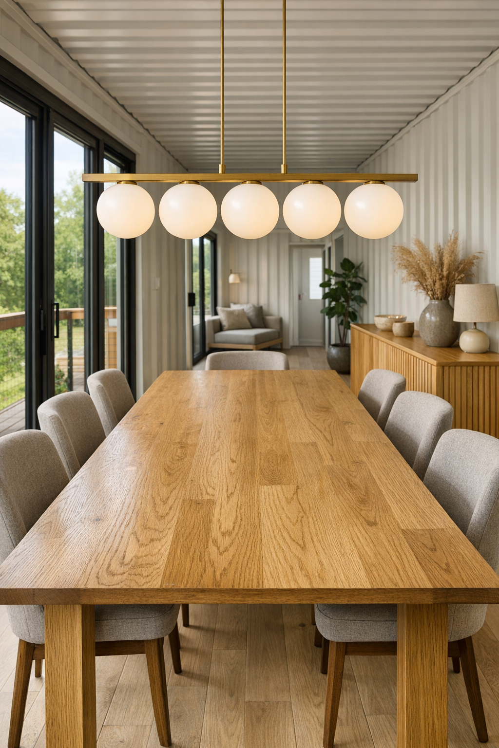
The dining room carries the same understated warmth but introduces a slightly more tailored mood. A long solid-oak table with a matte natural finish sits at the center, surrounded by upholstered dining chairs in a stone-colored performance fabric that feels equal parts polished and practical. I can easily picture a big weekend meal here, because the proportions leave enough circulation space to feel relaxed rather than formal. Overhead, a linear pendant in aged brass and opal glass stretches the length of the table, giving the room a gentle rhythm and just enough glow to flatter both food and faces.
One of the nicest moves is the relationship between the dining area and the glazing. Instead of isolating the space, the design gives it broad views outward, which prevents the long rectangular footprint from feeling tunnel-like. A textured plaster wall adds subtle depth, while a low sideboard in ribbed oak provides storage for table linens, serving pieces, and all the little things that tend to migrate into dining spaces. The room feels calm, composed, and ready for use, which to me is the sweet spot—beautiful enough for occasion, but never too precious for an everyday bowl of pasta.
Kitchen
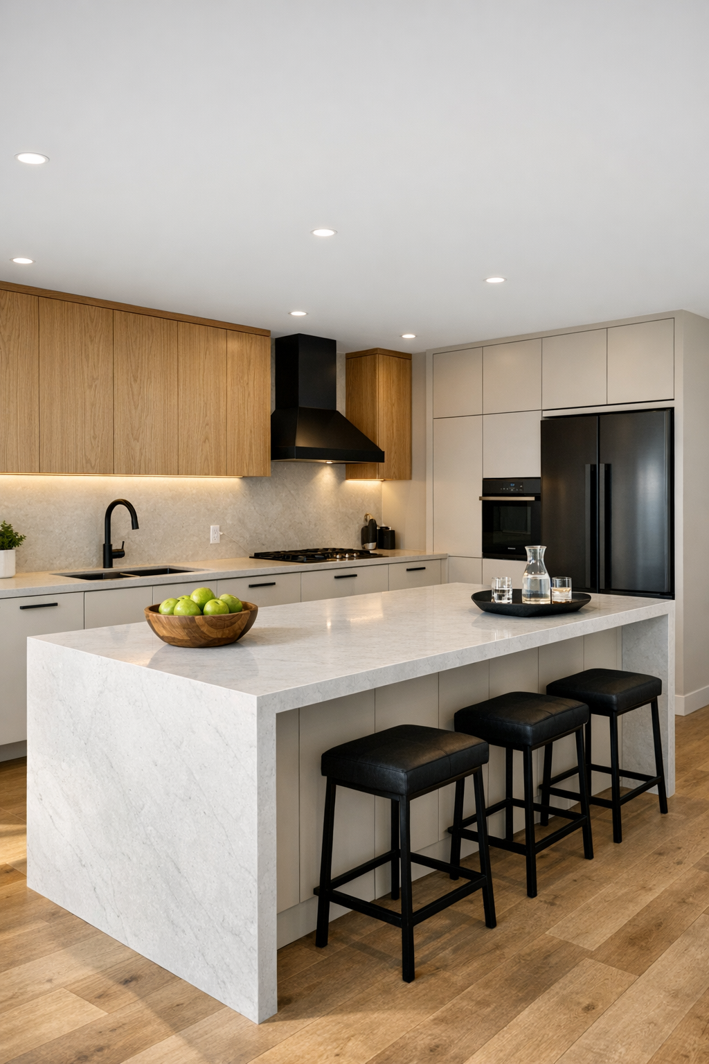
As someone who spends a lot of time thinking about how a kitchen actually functions, this one strikes me as especially well resolved. The cabinetry is a mix of pale almond lacquer lowers and rift-cut oak uppers, a combination that ties the kitchen directly to the home’s exterior while keeping the room from feeling flat. A long island in honed quartz—with faint sandy veining and waterfall sides—becomes the working heart of the space. It’s substantial without being bulky, and paired with simple wood-and-upholstery stools, it reads more as furniture than equipment.
The practical details are where the design really earns its keep. There’s a full-height pantry wall, integrated appliances, and open shelving used sparingly enough to stay attractive. A slab backsplash in the same quartz keeps the lines clean, and under-cabinet lighting makes prep zones bright without harshness. I also like the way the metal accents have been handled: matte black faucet, slim pulls, and discreet appliance trim that echo the window frames elsewhere in the house. The whole room feels crisp, efficient, and very cook-friendly—exactly the kind of kitchen where you could move comfortably from chopping herbs to rolling dough to serving friends without missing a beat.
Bedroom
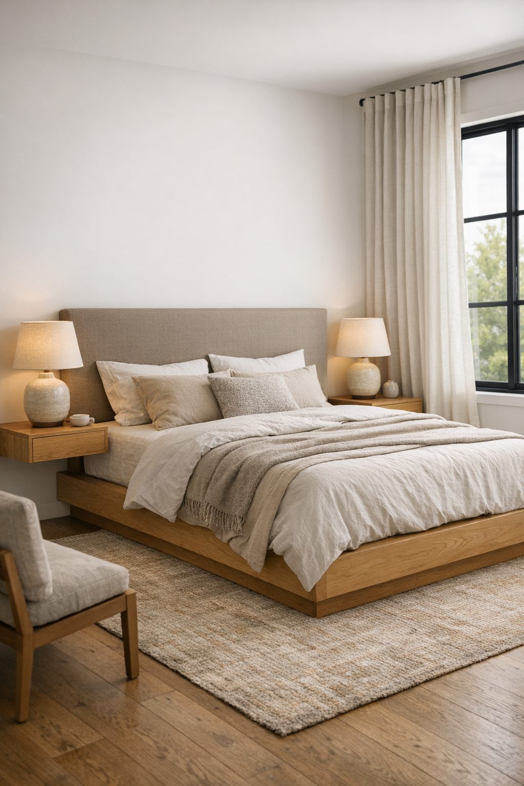
The bedroom takes the home’s restrained palette and makes it more intimate. A low platform bed in light oak is dressed in layered bedding—ivory, sand, and muted camel—with just enough variation in weave to give the room softness without clutter. Behind it, a full-width upholstered headboard in warm taupe visually stretches the room and cushions the container geometry. Instead of crowding the space with too much furniture, the design relies on a pair of floating nightstands, understated ceramic lamps, and a slim bench at the foot of the bed in boucle upholstery.
I’m especially drawn to the way the lighting and window treatment support restfulness here. Sheer linen panels filter the daylight, while blackout drapery in a slightly deeper oatmeal tone disappears into a recessed ceiling pocket when open. The walls are finished in a velvety warm white, and a large area rug with a subtle geometric pattern softens every step. There’s a quiet, hotel-like discipline to the room, but it never feels impersonal. It feels like a place where the day can genuinely slow down, which is more valuable than any decorative flourish.
Bathroom
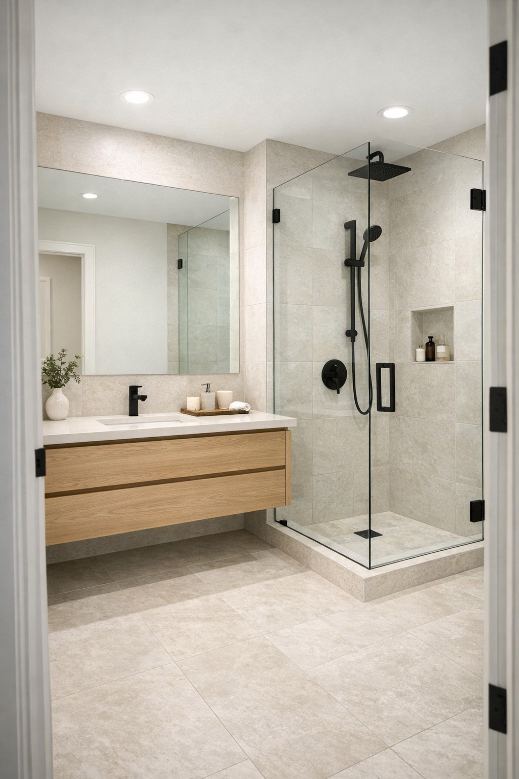
The bathroom leans into spa-like simplicity, but with enough material contrast to keep it visually alive. Large-format porcelain tile in a pale limestone tone wraps the floor and shower walls, setting a quiet foundation. A floating vanity in white oak introduces warmth, topped with a creamy solid-surface counter and integrated sink that keeps everything sleek and easy to maintain. Above it, a broad mirror stretches nearly wall to wall, doubling the light and making the room feel more expansive than its footprint suggests.
The shower is enclosed in clear glass with minimal black hardware, and I love the inclusion of a built-in niche finished in matching stone for a seamless look. Brushed nickel fixtures keep the palette soft, while wall sconces with frosted glass add flattering, even illumination. A small stool in teak, thick cotton towels, and one carefully placed ceramic vessel are enough to finish the room without cluttering it. Like a well-edited pantry, every element seems selected for purpose as much as beauty, and that balance gives the room its calm authority.
Other Areas
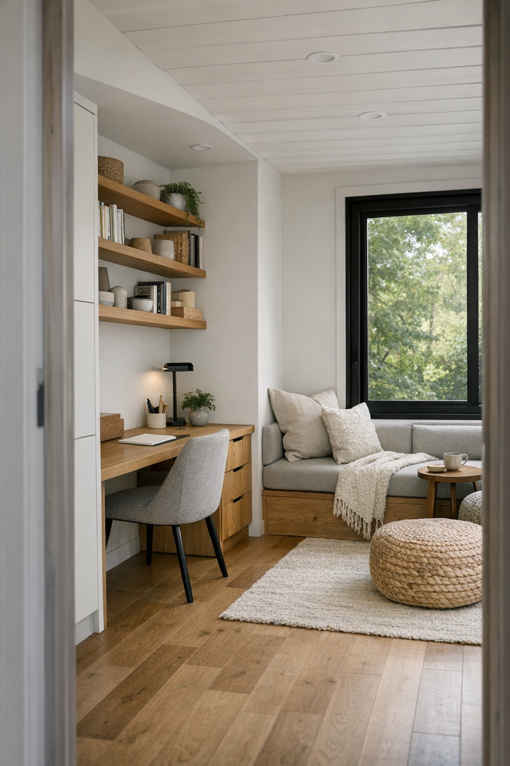
The circulation spaces and secondary zones are handled with the same care as the main rooms, which is often what separates a merely attractive home from a truly coherent one. Hallways are kept bright with skylights and slim wall washers, and built-in storage is integrated so cleanly that it reads as architecture rather than furniture. A compact home office nook includes an oak desk slab, open shelving, and an upholstered chair in muted gray, making excellent use of a narrow stretch of wall. There’s also a reading corner near a window with a sculptural lounge chair, a small side table, and a softly focused pendant that turns an in-between space into a destination.
I also appreciate the practical support spaces: a mudroom-style entry with pale millwork and black hooks, a concealed laundry closet with stacked machines behind flush doors, and transitional cabinetry that keeps daily clutter under control. These are the ingredients that make modern interiors actually livable. In a home with such disciplined design, these quieter areas prevent the overall look from becoming performative. They support the rhythms of coming in, putting things away, sitting down for a minute, and getting on with the day—and that, in the end, is what good design should do.
Why You'd Live Here
You’d live here because it proves compact architecture can still feel generous, polished, and deeply habitable. The container framework gives the home discipline, but the pale almond palette, natural wood, soft textiles, and carefully managed light make it feel easy on the senses. I think that combination is what lingers: the home is visually memorable, yes, but it also seems to understand daily life, from cooking and gathering to retreating and resting.
More than anything, this design succeeds because it never confuses minimalism with austerity. Every room offers warmth, utility, and a clear point of view, and the overall effect is wonderfully magnificent in the most grounded way possible. If you’re drawn to modern homes that feel edited but not empty, architectural but not intimidating, this is the kind of place that would keep revealing its strengths long after the first impression.