
There’s a grounded, welcoming quality to this chestnut brown container home that caught my attention immediately. Set up as an accessible retreat with a refined modern-rustic sensibility, it balances the clean geometry of repurposed steel volumes with a surprisingly warm interior language of wood, soft neutrals, matte black accents, and generous natural light. I’m always drawn to homes that feel practical without sacrificing beauty, and this one manages that balance with real confidence.
What makes it special is the way accessibility is treated not as an afterthought, but as the starting point for a more gracious way of living. In this concept design, wider passages, flush thresholds, thoughtful circulation, and easy-to-reach details are folded into a composition that still feels layered, elegant, and deeply livable. The result is a home that feels calm and capable, with every room tuned for comfort, ease, and a sense of everyday pleasure.
Exterior
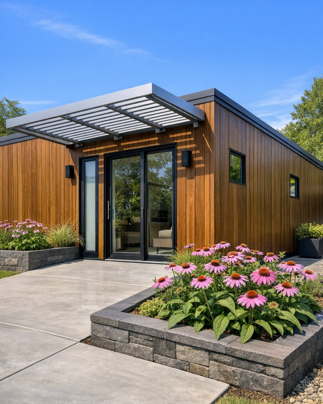
From the outside, the chestnut brown cladding gives the container structure a richness that softens the industrial bones without hiding them. I like how the color reads differently over the course of the day: almost cocoa in low light, warmer and more coppery in the sun. The linear form is broken up with large black-framed windows, a gently sloped entry walk, and a covered porch that makes the approach feel welcoming rather than severe. Clean seams, restrained metal detailing, and low-profile railings keep the architecture crisp, while planters and native grasses add movement and a softer edge.
The accessible entry is especially well handled. Instead of feeling purely utilitarian, the walkway is integrated into the landscape and front elevation so naturally that it becomes part of the design rhythm. A broad front door with a minimal threshold, easy exterior lighting, and a sheltered landing all contribute to a sense of ease. This is the kind of exterior that tells you a lot about the house before you even step inside: straightforward, thoughtful, and warmer than the container typology might lead you to expect.
Living Room
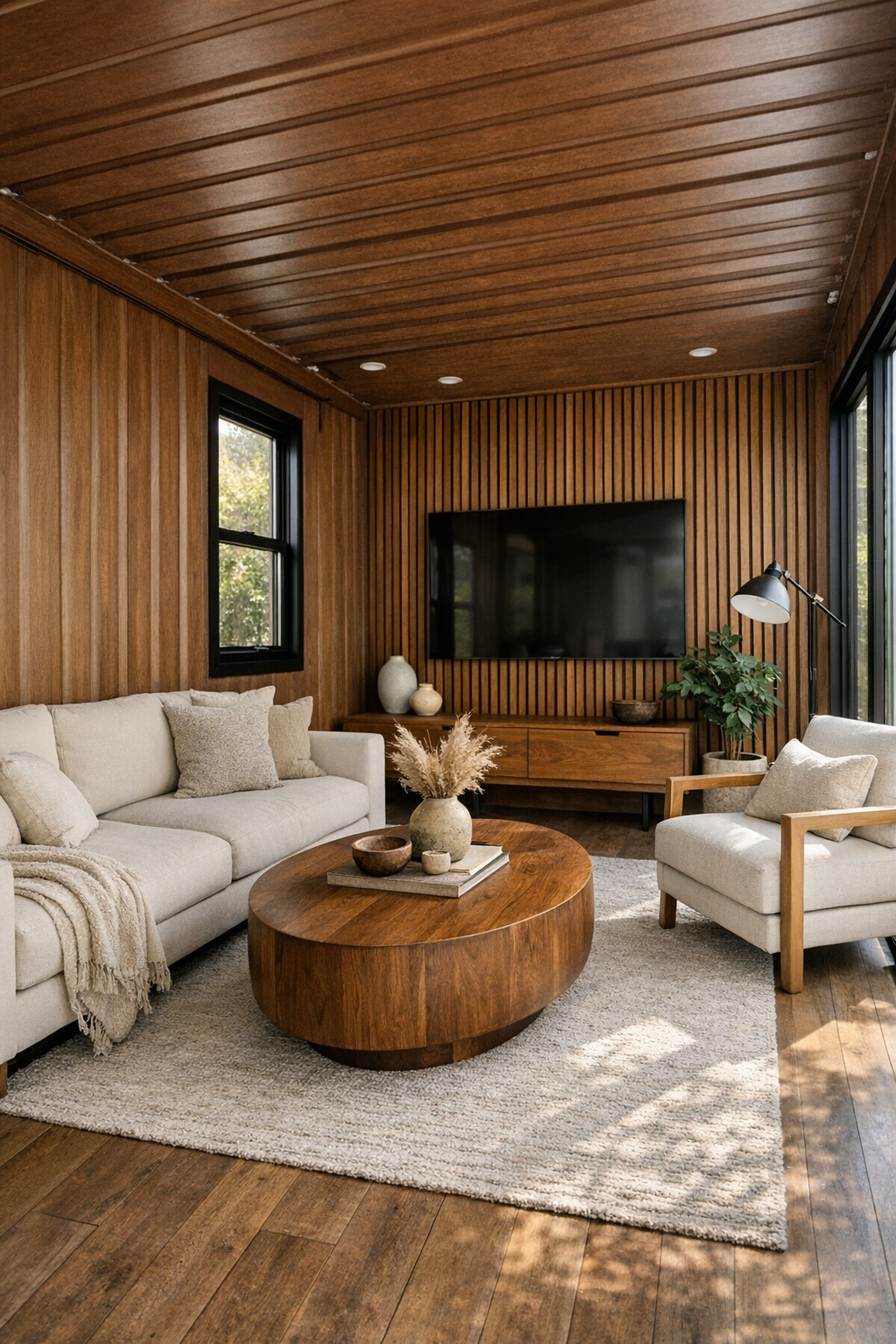
The living room opens with a sense of generosity that’s hard to achieve in a container-based home, and that’s due in large part to the layout. The space is kept visually open with wide circulation paths, low-profile furniture, and a restrained palette of cream, oat, chestnut, and charcoal. A large area rug anchors the seating zone without creating visual clutter, while a sofa with clean lines and supportive proportions faces a simple media wall clad in warm wood slats. I appreciate that the room doesn’t try too hard; it lets texture do the work.
Lighting is layered beautifully here. Recessed ceiling fixtures keep the room bright and even, while a sculptural floor lamp and concealed shelf lighting add warmth in the evening. The black window frames sharpen the view and give the softer furnishings some definition. Bouclé accent chairs, a solid wood coffee table with rounded corners, linen drapery, and a mix of matte and brushed finishes make the room feel tactile and polished. It’s a space that feels easy to move through, easy to settle into, and wonderfully calm.
Dining Room
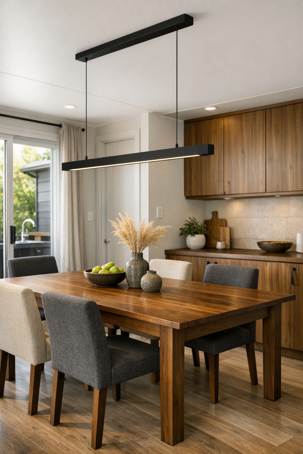
The dining area carries the same disciplined warmth, but with a slightly more intimate mood. A solid wood dining table in a medium walnut tone sits comfortably at the center, with ample clearance around it for easy movement. Upholstered dining chairs with supportive backs keep the look soft, and I like that the furniture avoids anything too bulky or ornate. The proportions matter here: the table is substantial enough to feel grounded, yet not so large that it overwhelms the footprint.
Overhead, a linear pendant in a matte black finish brings definition without visual heaviness. One of my favorite details is the way the dining room borrows light from adjacent spaces, allowing it to feel connected rather than tucked away. A built-in sideboard offers practical storage in a seamless way, finished in the same warm wood tone used elsewhere for continuity. The overall effect is inviting and quietly elegant, exactly the kind of dining room where a weeknight soup can feel as considered as a holiday meal.
Kitchen
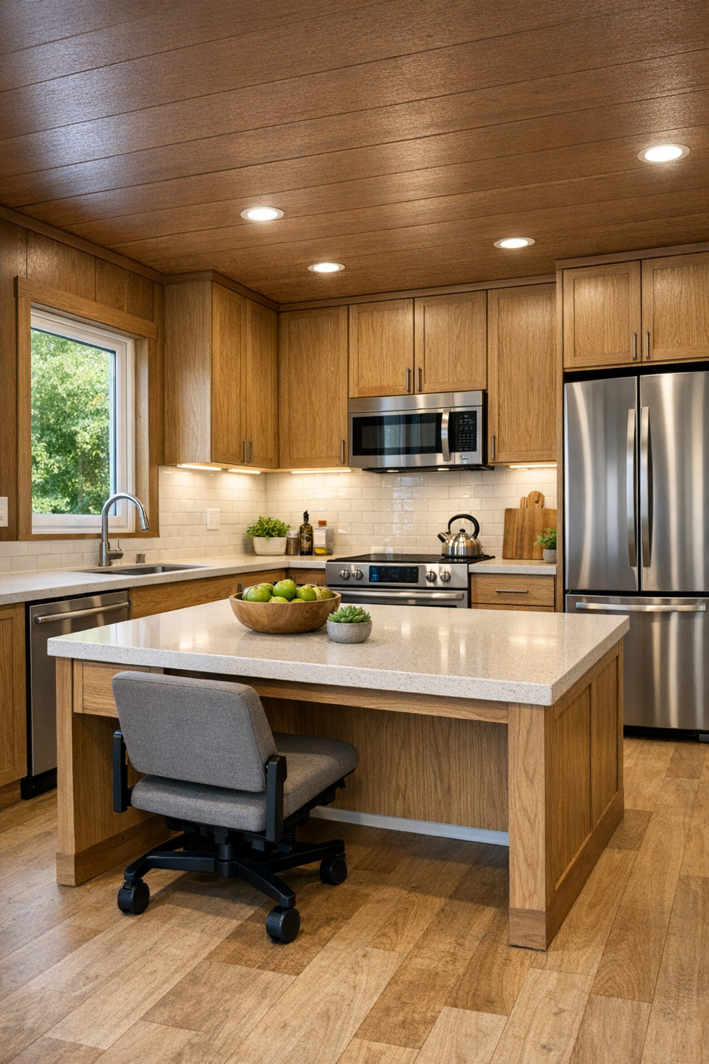
As someone who spends a lot of time thinking about how kitchens actually work, this one is especially satisfying. The layout is efficient but not cramped, with generous clearances, easy turning space, and work surfaces placed for comfort and reach. Flat-panel cabinetry in a warm oak finish is paired with pale quartz counters and a full-height backsplash that keeps the room bright and easy to maintain. The hardware is minimal, the lines are clean, and the visual calm makes the kitchen feel larger than it is.
A central island, designed with accessible knee space on one side, acts as both prep station and casual gathering spot. I can imagine chopping herbs here with sunlight pouring in across the countertop. Integrated appliances keep the look seamless, while under-cabinet lighting adds practical task illumination. Open shelving is used sparingly for ceramics and everyday pieces, which gives the kitchen personality without sacrificing order. It’s a very smart room: beautiful, highly functional, and built for real cooking rather than just display.
Bedroom
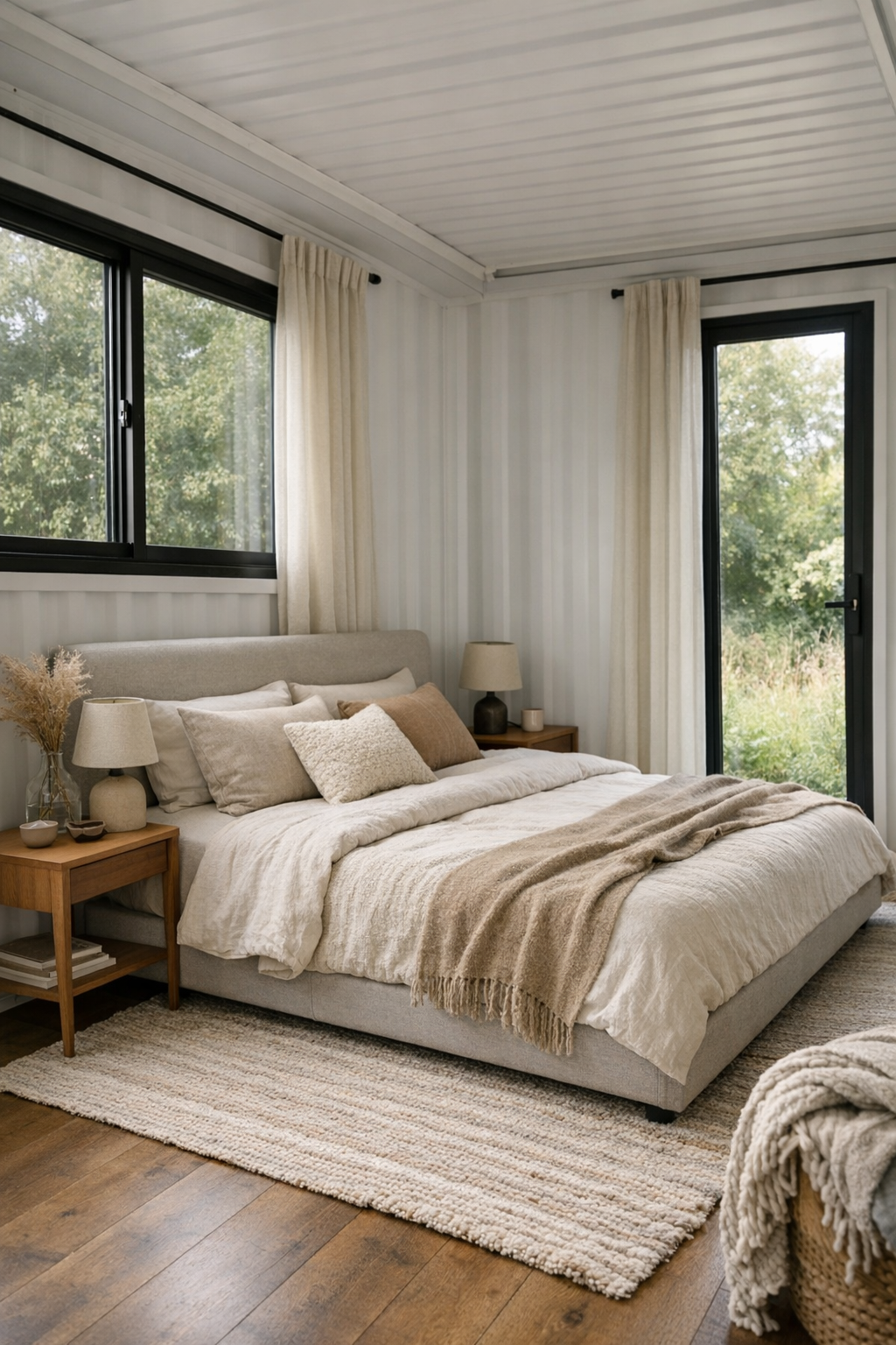
The bedroom feels like an exhale. The palette shifts slightly softer here, with sandy neutrals, warm whites, and layered chestnut tones that echo the exterior. A low platform bed with an upholstered headboard keeps the profile relaxed and the sightlines open. I like the way the room avoids excess furniture, relying instead on a few well-scaled pieces: slim nightstands, a wide dresser, and perhaps a small bench with rounded edges at the foot of the bed. The restraint makes the room feel restful and easy to navigate.
Textiles do a great deal of work in this space. Washed linen bedding, a nubby wool throw, and a subtle textured rug add comfort without busyness. Black-framed windows bring in daylight while tying the room back to the architecture, and layered window treatments offer softness and privacy. Bedside sconces free up surface space, which is both practical and elegant. This bedroom understands that luxury can come from simplicity, especially when every detail has been considered for comfort and ease.
Bathroom
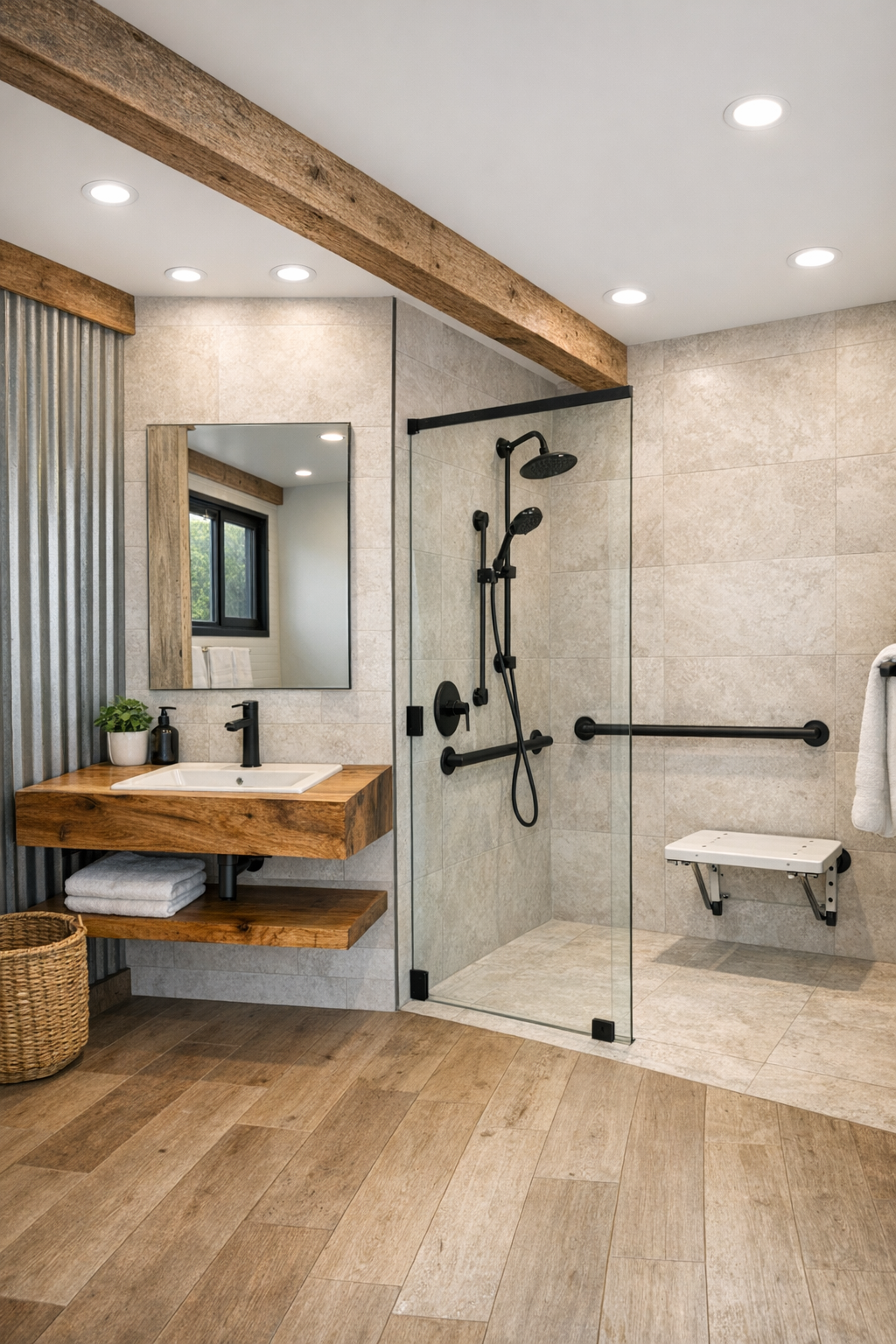
The bathroom is one of the most thoughtfully resolved spaces in the home. It combines accessibility and spa-like quiet in a way that feels completely natural. Large-format porcelain tile in a pale stone look wraps the room, reducing visual interruption and helping the footprint feel broader. A curbless shower with a clear glass panel keeps the sightlines open, and the fittings are finished in a soft matte black that adds contrast without harshness. Everything is easy to reach, easy to maintain, and beautifully composed.
The vanity is wall-mounted, which lightens the room visually and allows for practical clearance below. A wide mirror amplifies light, while discreet sconces on either side provide flattering, even illumination. I also like the use of warm wood in the vanity front, which prevents the space from feeling overly clinical. Thoughtful storage niches, a built-in shower bench, and clean, carefully placed hardware all support the larger design idea: comfort through clarity. It’s a bathroom that feels serene and highly competent at once.
Other Areas
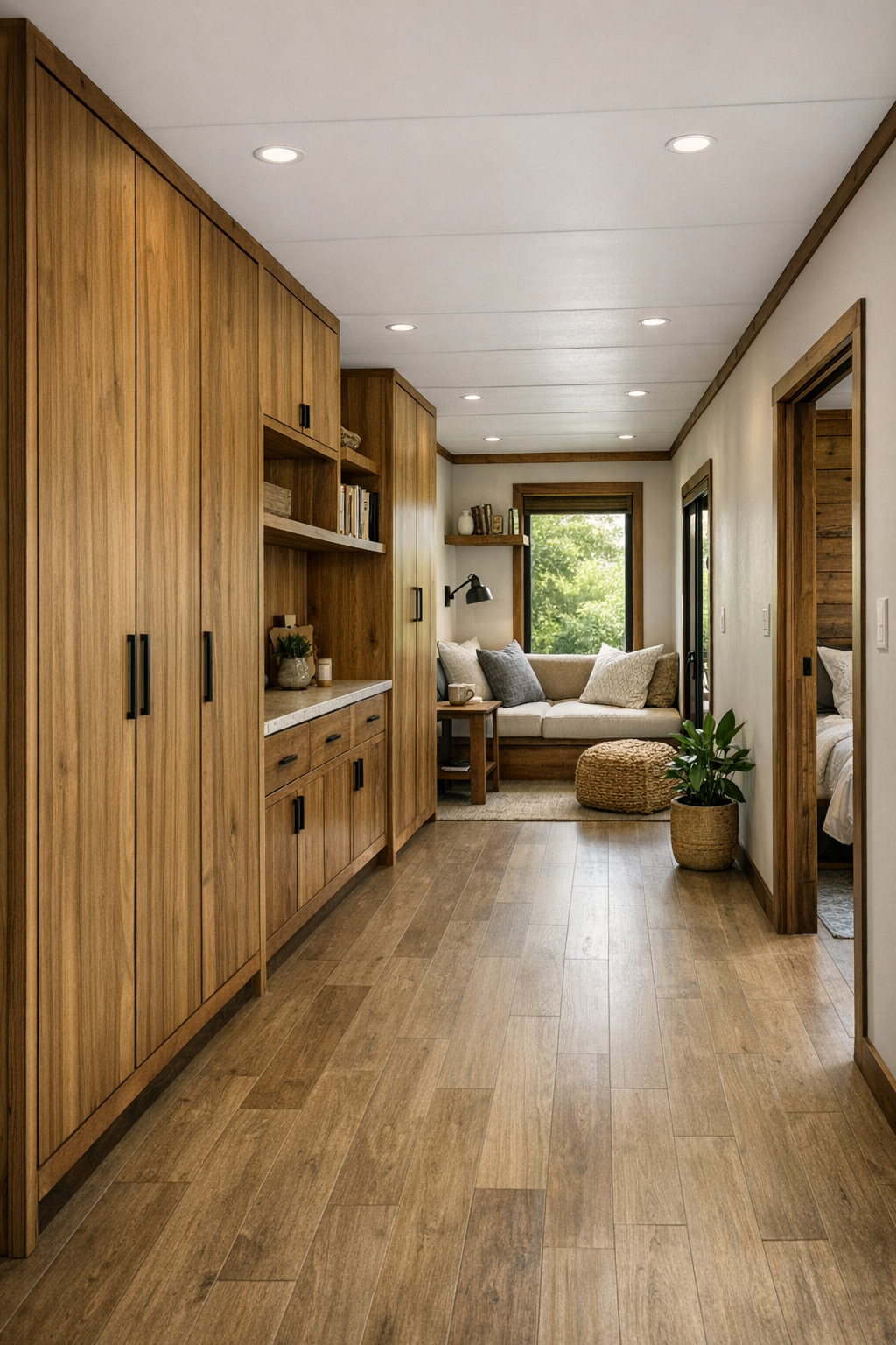
Beyond the main rooms, this home continues to impress in the transition spaces, which are often where good design either succeeds or falls apart. The hallway is wide and uncluttered, with flush flooring that runs continuously from room to room, helping the entire home feel cohesive. Built-in storage is integrated with care, using the same warm wood tones and minimal detailing seen throughout the house. A small reading nook near a window turns what could have been leftover space into a genuinely inviting corner.
If there’s a laundry or utility zone tucked into the plan, it follows the same logic: organized, streamlined, and surprisingly handsome. I can easily picture a mudroom-style bench, simple hooks, and practical cabinetry that keeps essentials close at hand without visual mess. Even the thresholds and door hardware feel considered. These supporting spaces reinforce the larger message of the home, which is that beauty and usability are most convincing when they show up everywhere, not just in the showpiece rooms.
Why You'd Live Here
You’d live here because it offers something rarer than mere style: it offers ease with dignity. The accessible design choices are integrated so gracefully that they improve the experience of the home for everyone, making daily life feel smoother, calmer, and more comfortable. I find that deeply appealing. Nothing feels forced, and nothing reads as a compromise.
You’d also live here because it understands warmth. Despite its container structure and modern lines, this home never feels cold or overly industrial. The chestnut palette, natural wood, soft textiles, and clear, practical planning create a home that supports real life beautifully. For me, that’s the lasting achievement here: a house that looks memorable, works hard, and still knows how to welcome you in.