
There is something so reassuring about a home in brick red. It has the same steady, welcoming feeling as an old barn at dusk or a favorite Dutch oven set on the stove, and this accessible container home leans into that comfort with surprising grace. Set in what feels like a peaceful edge-of-town landscape, the design pairs the sturdy, practical bones of container architecture with a softness that makes the whole place feel settled, sunny, and deeply livable. Even as a concept design, it feels rooted in real life, with thoughtful circulation, generous natural light, and a warm modern style that never turns cold.
What caught me right away is how carefully the home balances utility and beauty. The lines are clean and unfussy, but the materials keep it from feeling stark: warm woods, creamy walls, matte black accents, and that rich exterior color working like a thread that ties everything together. The accessible planning is folded into the design so naturally that it simply reads as good manners in architecture—wide passages, easy movement, comfortable proportions, and spaces that invite you to slow down and stay awhile.
Exterior
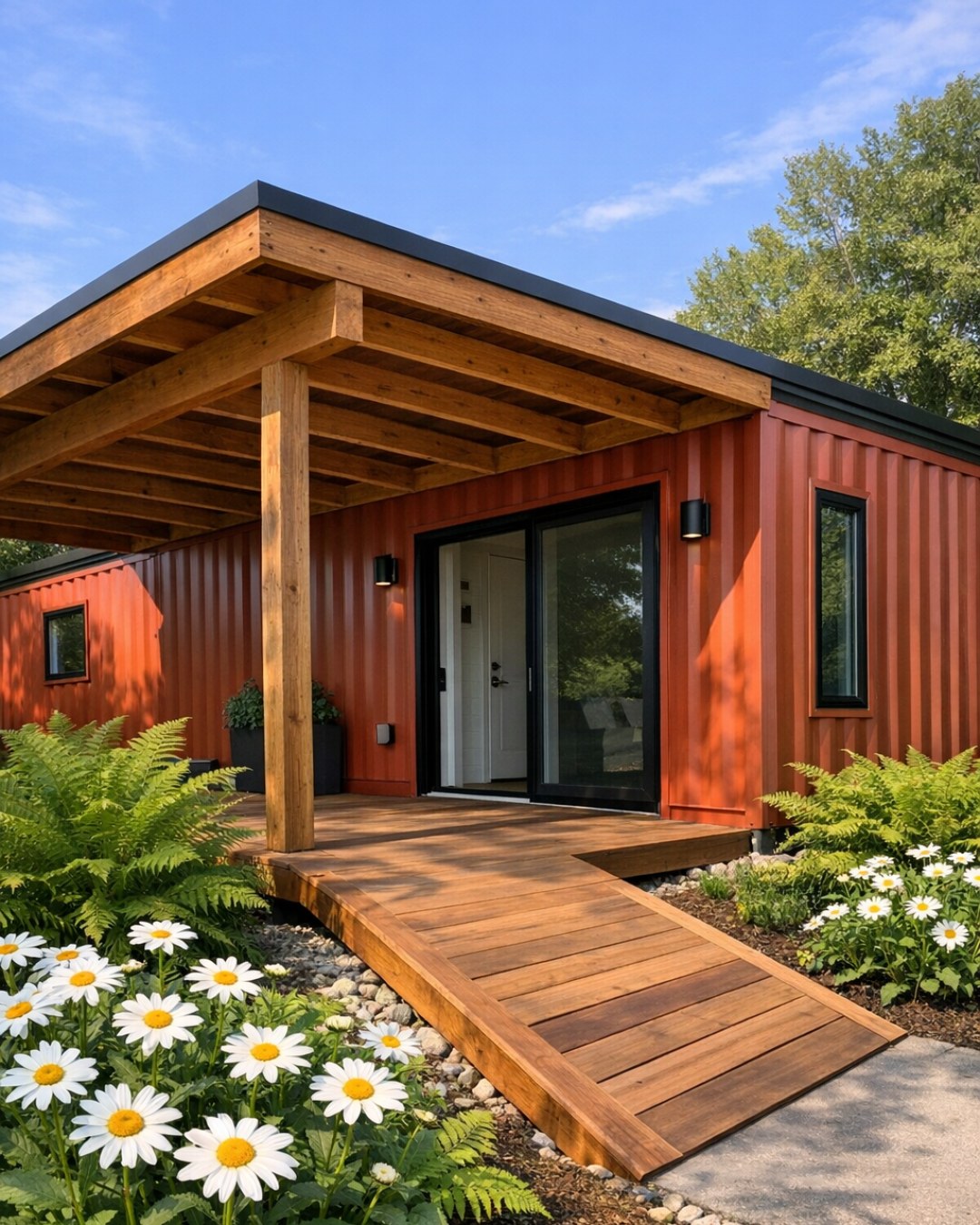
From the outside, the home has a handsome, grounded presence. The brick red cladding gives the container form a welcoming weight, while crisp trim and simple geometric lines keep it looking fresh rather than rustic. I can imagine it sitting beautifully against prairie grasses or a gravel drive, with the color glowing especially nicely in late afternoon light. The entry sequence appears intentionally gentle, with a no-step approach, broad walkway, and a covered porch area that softens the industrial silhouette and makes the front door feel like a true arrival point rather than an afterthought.
What I appreciate most is the way the exterior avoids showing off. Instead of trying to disguise the container origins completely, the design honors them while refining them with thoughtful detailing. Large windows break up the mass and promise bright interiors, while black-framed glazing adds a neat, tailored contrast against the red. A bit of wood at the soffits or entry surround gives the whole composition warmth, and the landscaping feels simple and sensible—low-maintenance plantings, clean edging, and room to move comfortably around the house without fuss.
Living Room
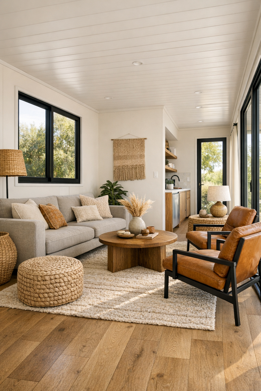
The living room is where the home’s warmth really settles in. I picture wide-plank oak flooring underfoot, creamy white walls, and a soft greige sofa with deep cushions that looks made for long visits and Sunday afternoon naps. A pair of caramel leather chairs adds a little richness without feeling formal, and the lines of the furniture stay open enough to preserve easy movement throughout the room. Because accessibility is handled so gracefully here, nothing feels crowded; there is breathing room around the coffee table, a clear path to the adjacent spaces, and seating arranged for conversation instead of display.
Light does a lot of the heavy lifting in this space. Big windows bring in a cheerful wash of daylight, and in the evening I imagine layered lighting taking over: a simple linen-shaded floor lamp, a pair of sconces, maybe a low-profile ceiling fixture in matte black or aged brass. Textures keep the palette from going flat—a nubby throw, woven baskets, a wool area rug with a quiet pattern, and natural wood accents that gently echo the outdoors. It feels modern, yes, but in the best way: tidy, calm, and easy to live with.
Dining Room
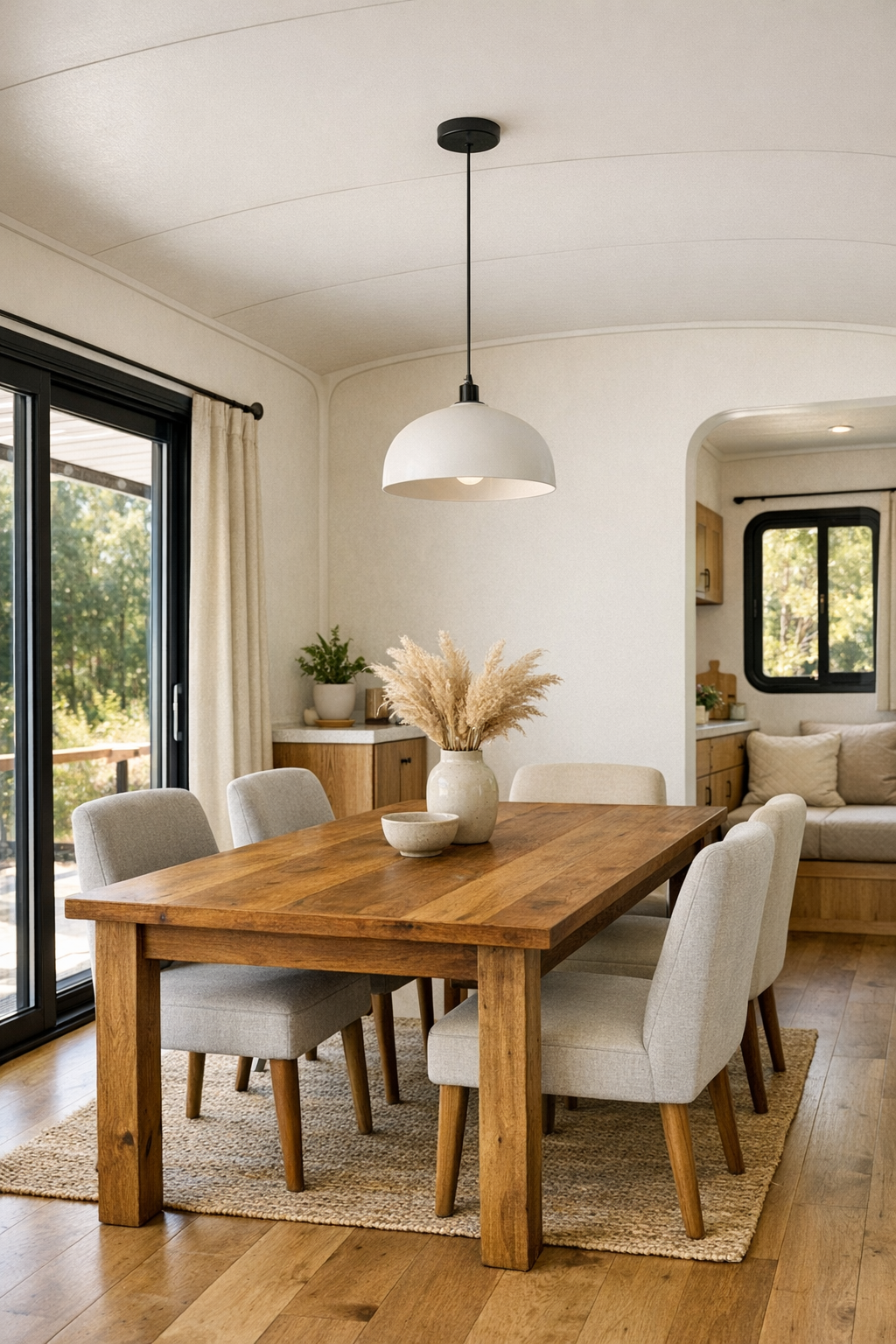
The dining area feels like one of those spaces that quietly becomes the heart of the house. It is not overly grand, and that is exactly why it works. A sturdy wood dining table with rounded corners seems right at home here, paired with comfortable upholstered chairs that are easy to slide in and out. The layout likely keeps generous clearance around the table, which makes the room feel more relaxed and welcoming, whether you are setting out a holiday supper or just a plate of biscuits and jam with coffee in the morning.
I love the idea of this room borrowing light from more than one direction, perhaps with a window nearby and sightlines opening into the living area and kitchen. A simple pendant above the table—something sculptural but not flashy—would anchor the space beautifully. The finishes stay consistent with the rest of the house: warm wood, soft neutrals, black accents, and maybe a touch of muted rust or clay in the textiles as a quiet nod to the exterior. It has the kind of plainspoken prettiness that never wears thin.
Kitchen
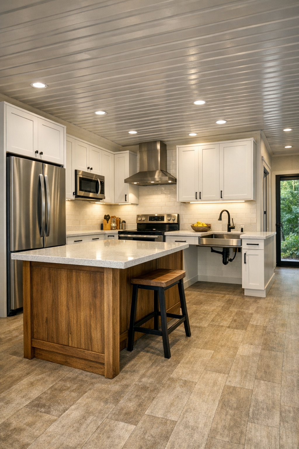
Now this kitchen speaks my language. It looks planned by someone who understands that a pretty kitchen is nice, but a kitchen that truly works is a blessing. The cabinetry feels clean and Shaker-inspired, likely in a warm white or light mushroom tone, with easy-grip hardware in matte black. A generous aisle width is one of the best features here, making the room comfortable for movement and meal prep alike. I can imagine quartz counters in a soft veined pattern, a full-height backsplash for easy care, and open stretches of work surface that would make baking day a pleasure.
There is also a nice balance between polish and practicality. Wood shelving or a wood-toned island adds warmth so the room does not feel clinical, and stainless appliances sit neatly within the palette without taking over. Good task lighting under the cabinets would be worth its weight in gold, while pendant lights bring a little personality overhead. Altogether, the kitchen feels bright, efficient, and welcoming—the sort of place where a pot of soup can simmer while somebody pulls up a stool and keeps you company.
Bedroom
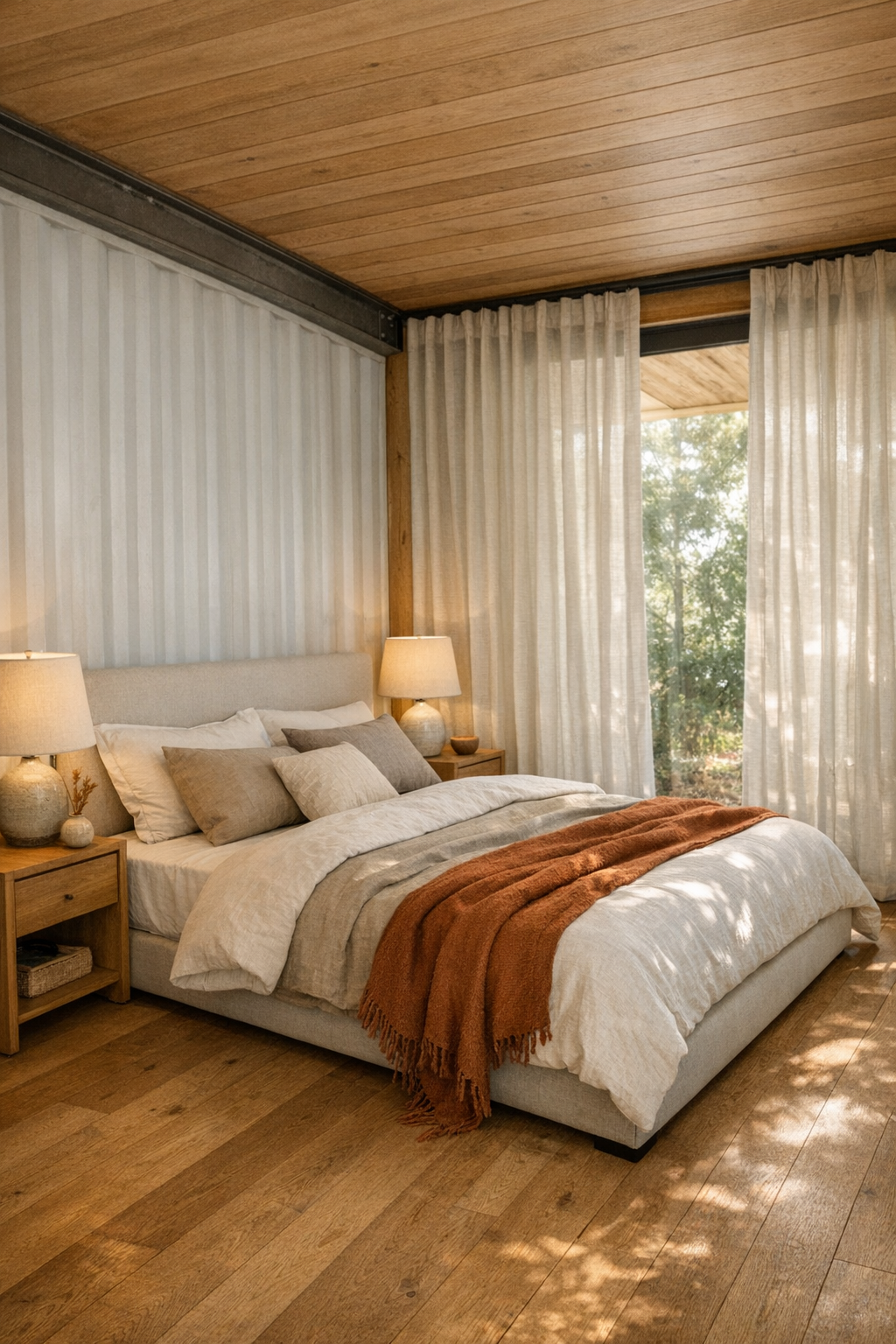
The bedroom carries the same gentle confidence as the rest of the home, but with an even quieter hand. I picture a low-profile bed with an upholstered headboard in a soft oatmeal fabric, layered with crisp white bedding, a quilted coverlet, and a rust-colored throw folded at the foot. The palette stays restful—cream, sand, muted clay, weathered wood—and the proportions are carefully managed so the room feels open instead of overfilled. There is enough space around the bed to move comfortably, and that alone gives the room a sense of ease that many larger homes never achieve.
What makes it feel especially inviting is the restraint. Rather than crowding the room with too much furniture, the design seems to rely on a few well-chosen pieces: slim nightstands, warm bedside lamps, perhaps a simple dresser or built-in storage that keeps clutter tucked away. Natural light would be softened with linen drapery or woven shades, and the textures do the comforting work—cotton, wool, wood grain, and soft upholstery. It feels like a room meant for true rest, the kind where you can hear yourself think.
Bathroom
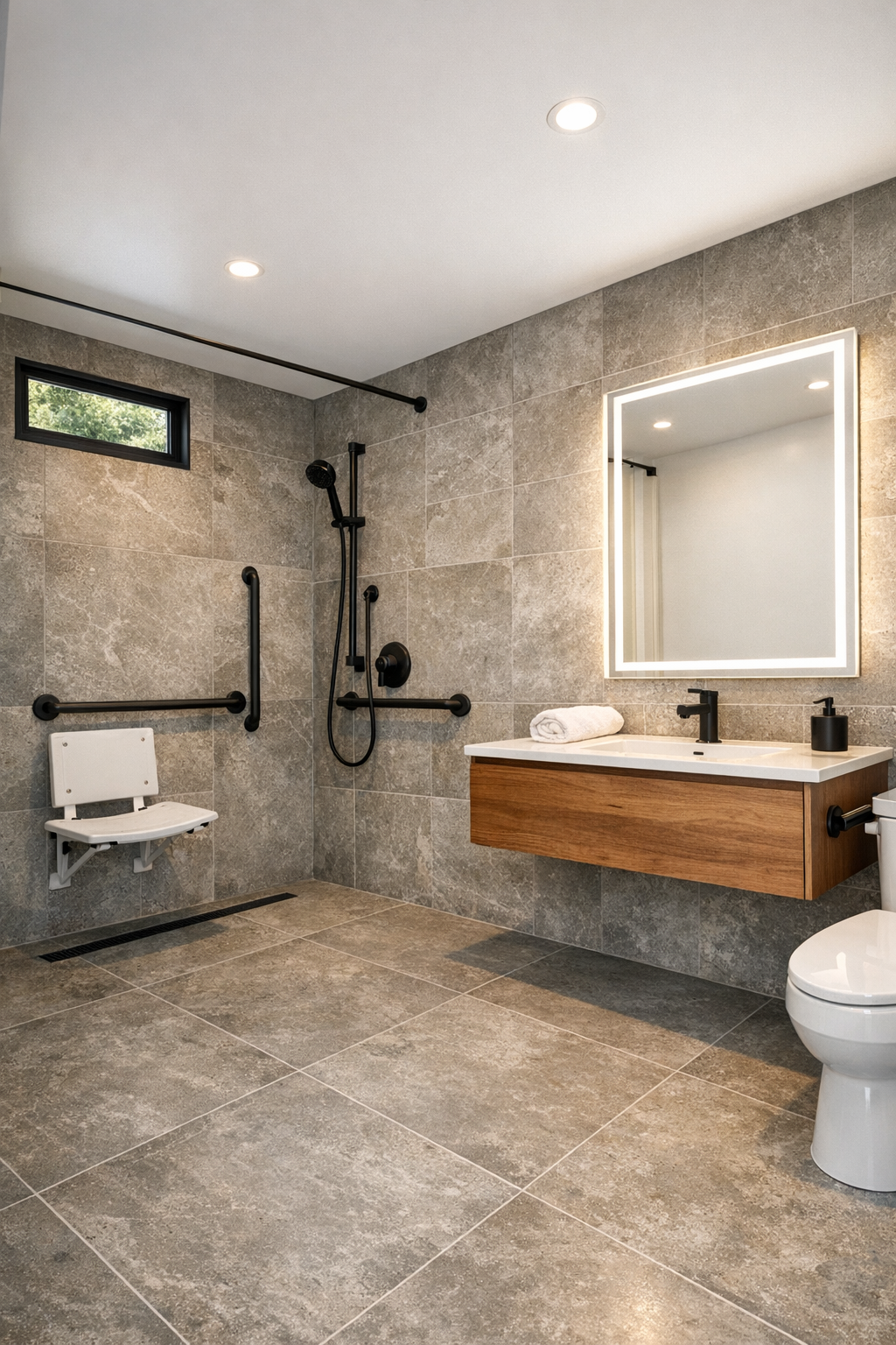
The bathroom looks to be one of the most thoughtfully resolved spaces in the house. Accessibility here is not only practical but elegant, with a curbless shower, wide clear floor area, and fixtures placed where they are easy to reach and use. I imagine large-format porcelain tile in a soft stone tone, which keeps grout lines minimal and the room feeling visually calm. A floating vanity in a warm wood finish would add both lightness and storage, while a broad mirror helps bounce daylight around the space.
There is a spa-like simplicity to the finishes that I find very appealing. Matte black plumbing fixtures sharpen the palette, while white counters and soft neutral walls keep the room bright and clean-looking. Good lighting at the mirror is essential, and here it would likely come from slender sconces or a clean-lined integrated fixture that flatters without glare. Nothing feels fussy, but everything feels considered, and that is often the secret to a bathroom you enjoy day after day.
Other Areas
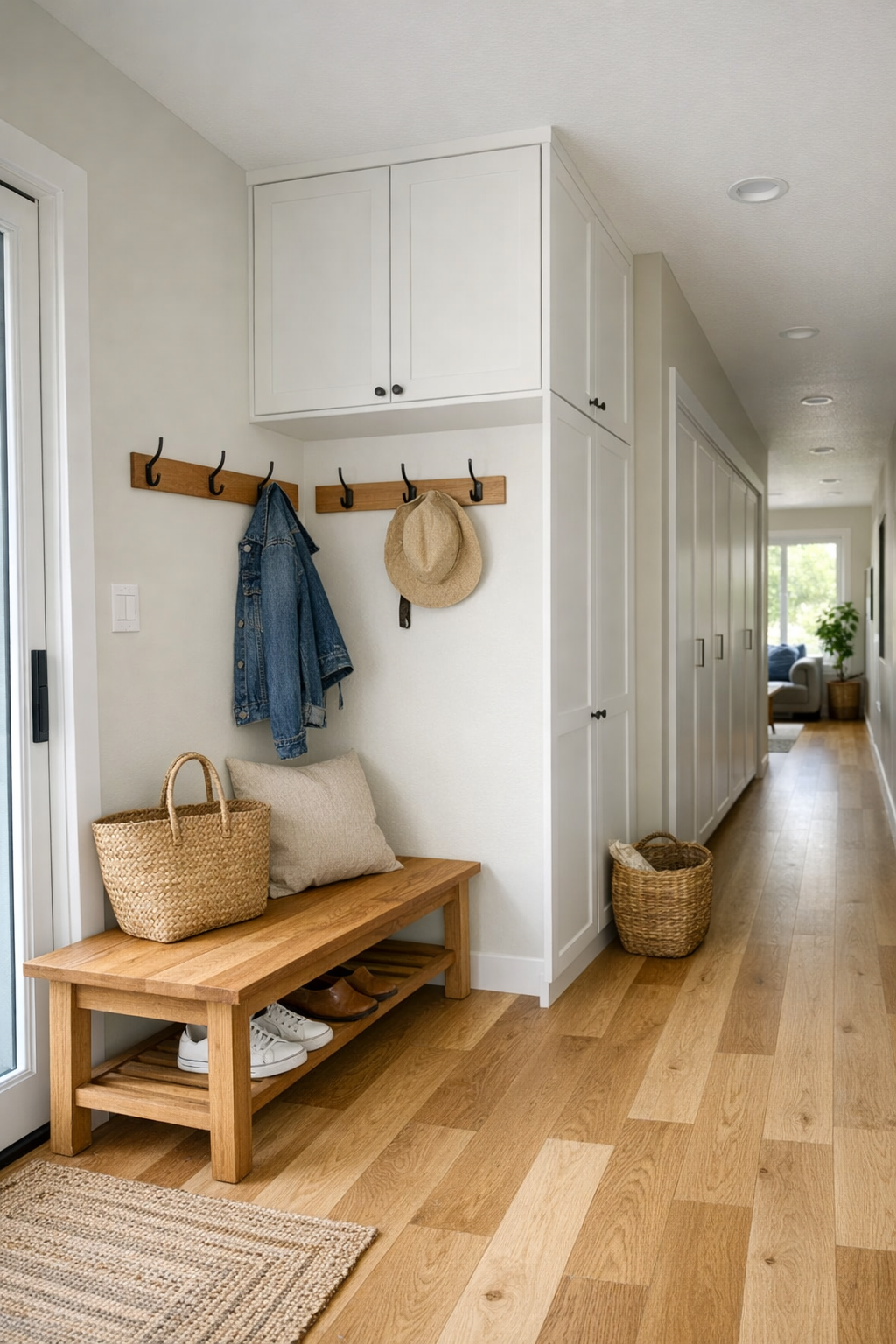
What I find especially appealing in a home like this is the attention paid to the in-between spaces. Hallways, entry zones, and built-in storage are often overlooked, but here they seem to be treated as part of the home’s overall hospitality. A small mudroom-style moment near the entrance—with a bench, hooks, and closed storage—would make everyday life so much easier. The circulation areas are likely bright rather than tunnel-like, helped along by pale wall colors, warm flooring continuity, and doors placed to preserve open sightlines.
If there is a laundry nook or compact home office tucked into the plan, I suspect it follows the same sensible design language: clean millwork, durable surfaces, and enough beauty to make routine tasks feel lighter. Even a reading corner by a window could become a favorite spot with just a good chair, a little table, and a lamp. That is the charm of this home—every square foot appears to be asked to work hard, but it does so with grace and a real understanding of how daily life unfolds.
Why You'd Live Here
You would live here because it proves that practical design can still feel deeply personal. This home does not chase grandiosity; it offers something better—comfort, clarity, and beauty that supports everyday living. The accessible layout makes movement easy, the palette is warm without being heavy, and the container structure brings a bit of ingenuity to the whole story. It feels efficient, but never spare.
To my eye, the real success of the home is that it understands what many people truly want: a place that is manageable, welcoming, and handsome in an honest way. The brick red exterior gives it character, while the interior softens everything into a calm, livable rhythm. It is the kind of home that invites you to put on a kettle, leave your shoes by the door, and stay long enough to make a life there.