
I’m always interested in homes that solve practical problems without giving up beauty, and this warm sage green container home does exactly that. Set on a simple, lightly landscaped site that lets the architecture take center stage, it feels calm, grounded, and welcoming from the first glance. The design blends the crisp structure of repurposed shipping containers with a softer, more livable palette of muted green, pale oak, creamy plaster, and matte black accents, creating a home that reads modern but never cold.
What makes it especially compelling to me is how accessibility is treated as a design strength rather than a compromise. This concept home is planned with generous circulation, level thresholds, intuitive storage, and rooms that feel open and easy to use, all while maintaining a polished, highly intentional look. Like a well-run kitchen, every element seems to know its job, and that clarity gives the whole home a sense of ease.
Exterior
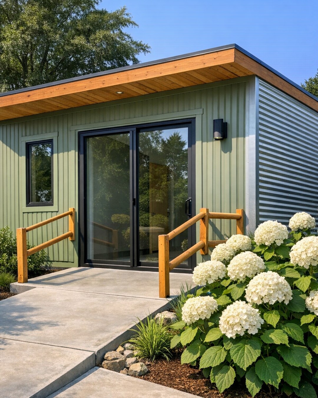
The exterior composition makes smart use of the container form, stacking and offsetting volumes just enough to create rhythm without turning the house into a visual puzzle. The main cladding is a warm sage green finish that softens the industrial lines, while sections of natural wood slats and charcoal metal trim add texture and contrast. Wide, gently sloped walkways replace any sense of a formal front stair, and the entry is sheltered by a clean overhang that makes arrival feel comfortable in every season. Large black-framed windows are placed with real discipline, giving the facade balance while pulling generous light deep into the interior.
I like that the landscaping is quiet and useful rather than fussy. Low grasses, native shrubs, and broad planting beds frame the home without obscuring it, and the hardscape is smooth, spacious, and easy to navigate. There’s a small covered terrace that extends the living space outdoors, with room for relaxed seating and container herbs close at hand. The overall effect is one of understatement: contemporary, accessible, and deeply livable, with a softness that keeps the container structure from feeling stark.
Living Room
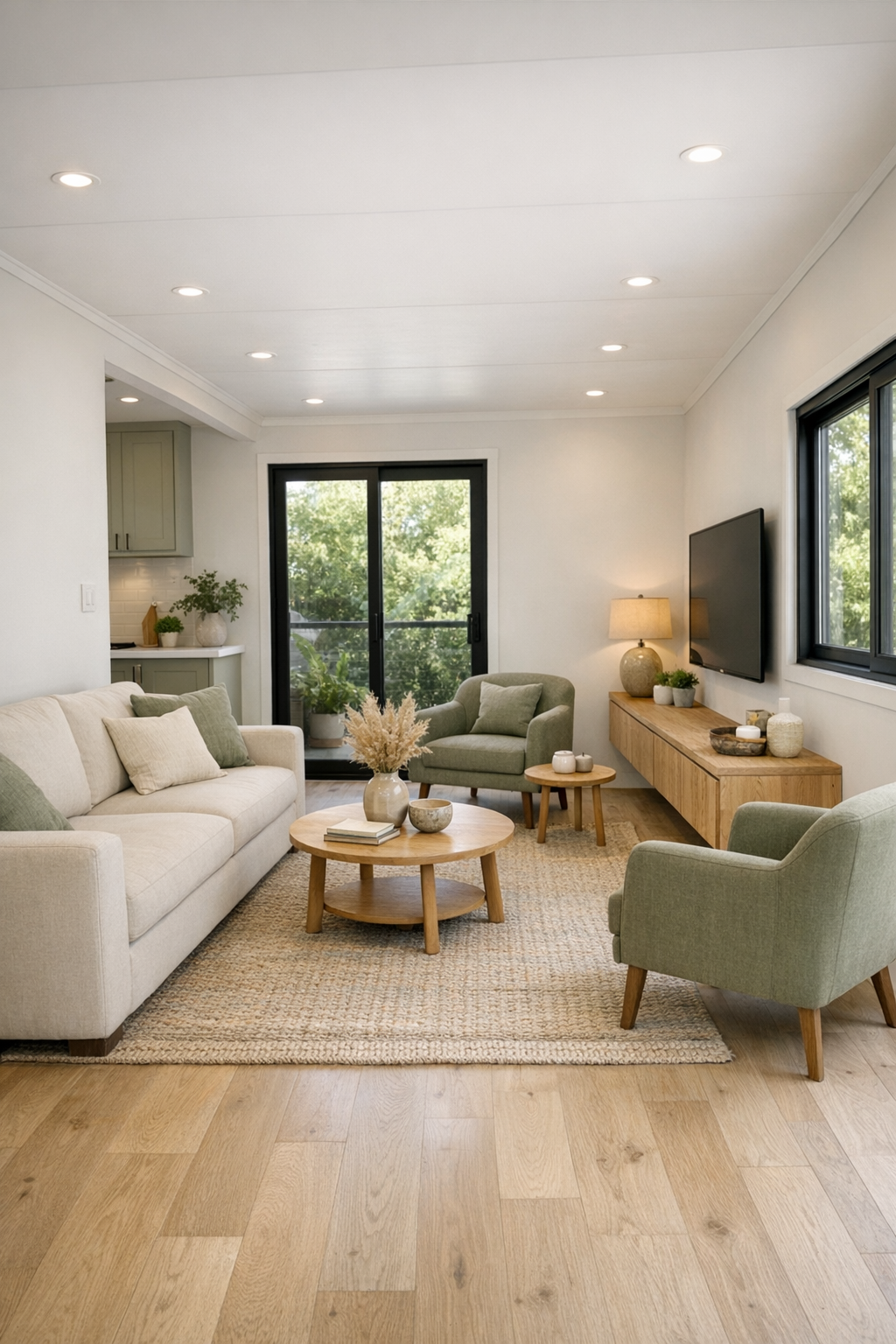
The living room is where the home’s warmth really settles in. The palette stays disciplined—sage, oat, sand, soft white, and black—but the layering keeps it rich. Pale oak flooring runs throughout, visually widening the room, and the walls are finished in a smooth warm white that reflects light without looking glossy. A low-profile sofa in textured cream is paired with two lounge chairs in muted olive fabric, and a large woven rug helps define the seating area while keeping transitions smooth and flush. The furniture arrangement leaves broad, clear pathways, which is both practical and visually calming.
Lighting is handled beautifully here, with daylight pouring in through oversized windows and supplemented by discreet recessed fixtures, a sculptural floor lamp, and a simple linear wall light. I’m especially drawn to the built-in millwork: a floating oak media console with rounded corners, open shelving for books and ceramics, and concealed storage that keeps the room from feeling busy. There’s nothing precious about it, but everything is considered. It has the same satisfaction as a well-organized pantry—easy to use, pleasing to the eye, and quietly efficient.
Dining Room
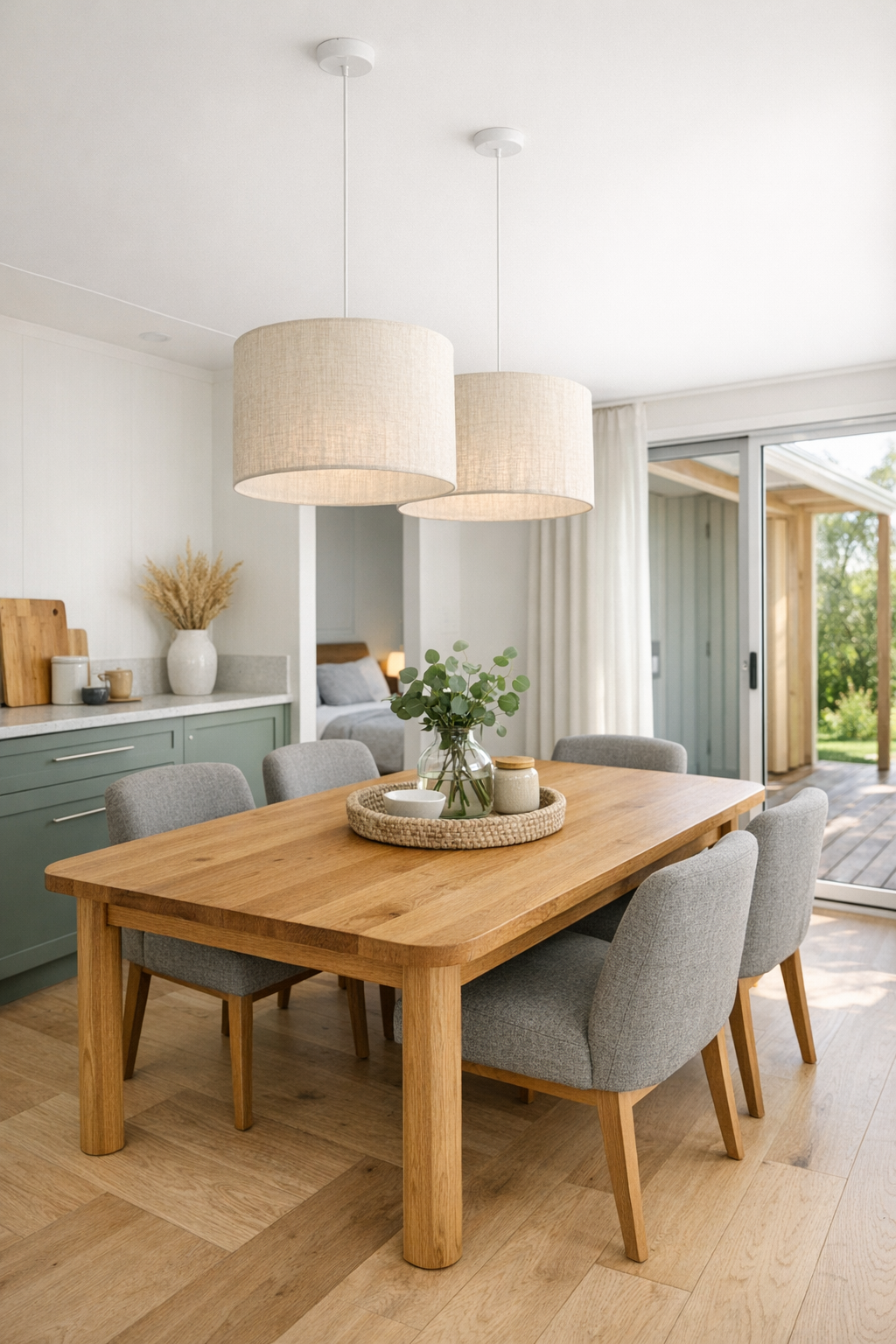
The dining area sits comfortably between the living room and kitchen, acting as the home’s social hinge. Rather than isolating it, the layout gives it breathing room, with enough clearance around the table for easy movement and seating that can be approached from multiple sides. A solid oak table with softly rounded edges anchors the space, surrounded by upholstered dining chairs in a durable warm gray fabric. The proportions are generous but not oversized, which helps the room feel intimate even within the open plan.
Materially, it continues the home’s gentle conversation between utility and softness. A linen pendant hangs low over the table, casting warm, diffuse light that flatters the wood grain and makes evening meals feel relaxed. One wall carries a built-in sideboard in sage-toned cabinetry with a pale quartz top, ideal for serving pieces, table linens, or extra dishware. I can easily imagine this being a favorite corner of the house—equally suited to a weeknight supper, a long coffee, or a marathon meal with friends where nobody is in a hurry to leave.
Kitchen
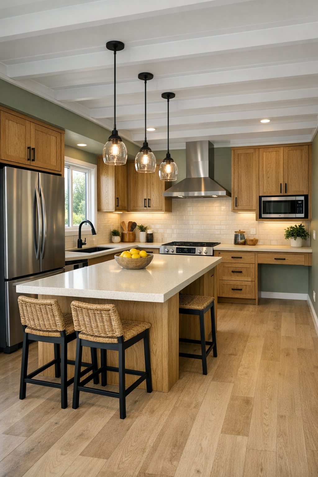
As an experienced cook, I tend to judge a home by its kitchen, and this one is impressively well resolved. The layout is highly functional, with an accessible work triangle that doesn’t feel forced: wide passages, easy-reach storage, varied counter heights, and an island designed for both prep and casual dining. Cabinetry in a muted sage finish gives the room its signature personality, while rift-cut oak lowers and open shelves add warmth. The countertops are a creamy quartz with subtle movement, and the backsplash is a handmade-look tile in a soft off-white that brings just enough texture to the composition.
What I appreciate most is the balance between serious usability and visual calm. Appliance fronts are integrated where possible, the hardware is slim and matte black, and task lighting under the cabinets is bright without being harsh. A deep single-basin sink sits below a wide window, and nearby storage is arranged with a cook’s logic in mind—drawers for pots, pull-outs for dry goods, and easy access to everyday tools. It feels like a kitchen designed by someone who understands mise en place: everything in the right place, ready to support the rhythm of daily life.
Bedroom
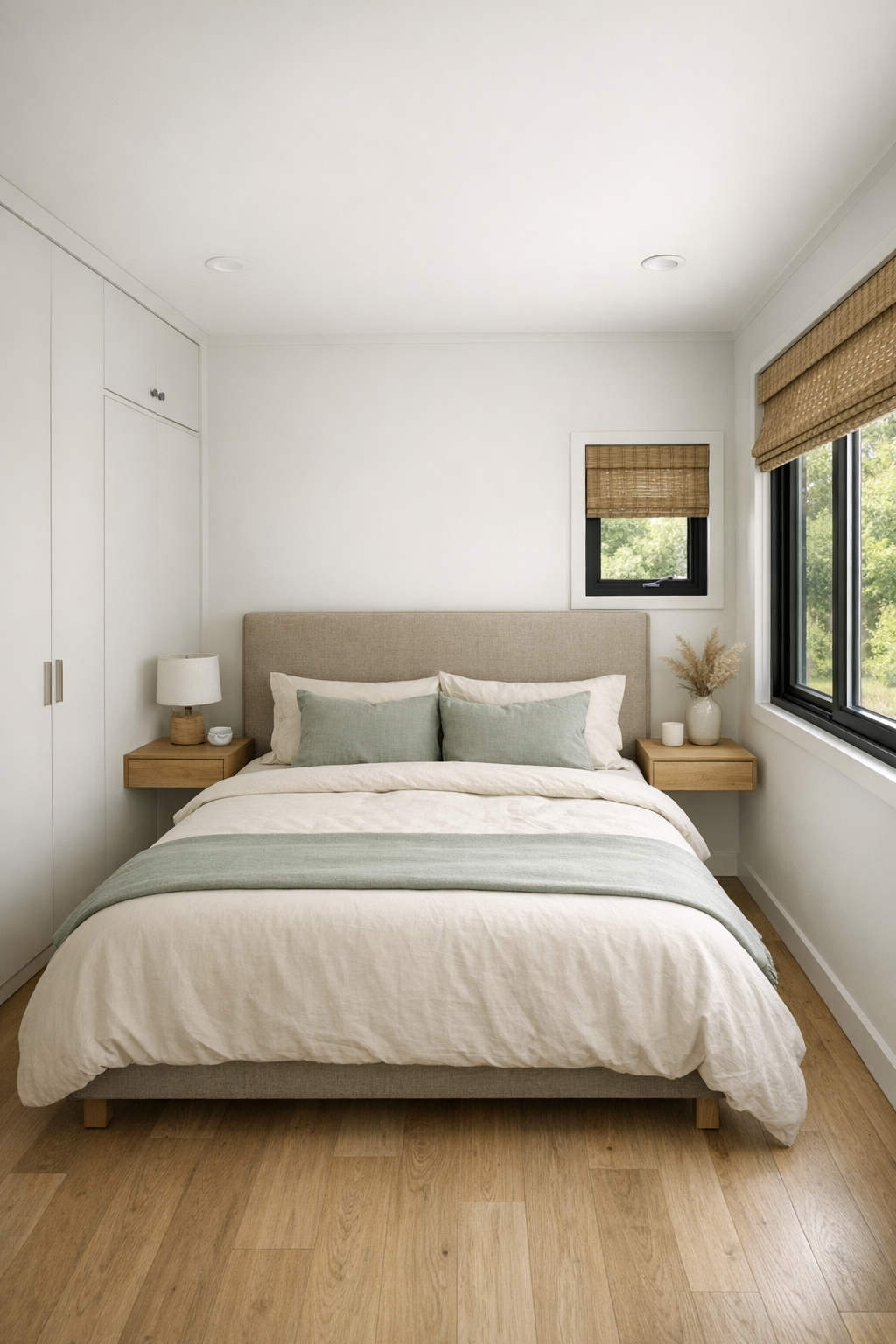
The bedroom is wonderfully restrained, which is exactly the right move in a home like this. The bed is centered on a softly upholstered headboard in a natural flax tone, with floating nightstands in pale oak that keep the floor line open and airy. Sage appears again, but more quietly here—in textiles, artwork, and perhaps a painted accent wall with a velvety matte finish. The linens are layered in ivory, stone, and soft green, creating a room that feels cool, breathable, and deeply restful without becoming bland.
Storage is built in rather than bulky, with streamlined wardrobes that sit flush to the wall and minimize visual clutter. Black-framed windows are dressed in simple woven shades and full-height drapery that softens the room acoustically as well as visually. I also like the lighting strategy: small reading sconces, hidden ambient lighting, and enough illumination to make the room functional without losing its serenity. It’s a bedroom that understands its purpose, offering quiet, order, and comfort in equal measure.
Bathroom
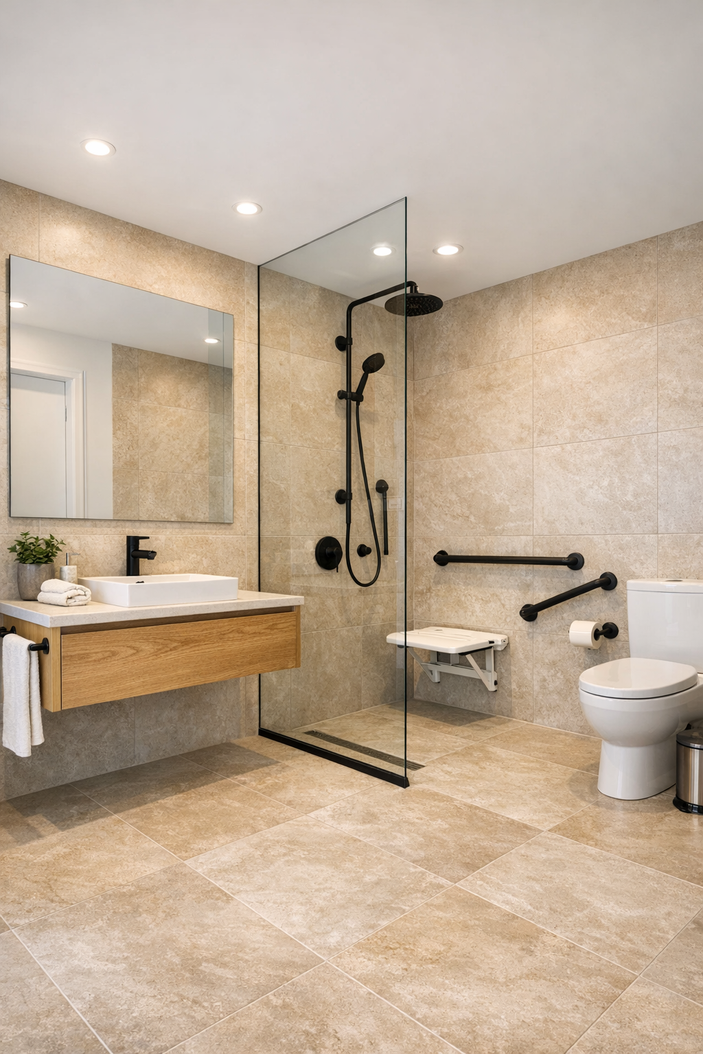
The bathroom carries the home’s accessible thinking in a particularly elegant way. The layout is open and efficient, with a curbless shower, wide turning space, and a floating vanity that keeps the room feeling light while improving usability. Large-format porcelain tiles in a warm limestone tone wrap the floor and shower walls, reducing visual busyness and creating a seamless, expansive effect. A frameless glass panel maintains openness, while matte black fixtures sharpen the palette just enough.
There’s also a softness here that I find especially successful. The vanity is finished in oak, the countertop is a pale solid surface with integrated sink lines, and the mirror is generously scaled to bounce light around the room. Layered lighting—recessed ceiling fixtures, vertical sconces, and daylight where possible—makes the space practical for daily routines without feeling clinical. It’s the kind of bathroom that proves accessibility can be not only discreet, but genuinely luxurious.
Other Areas
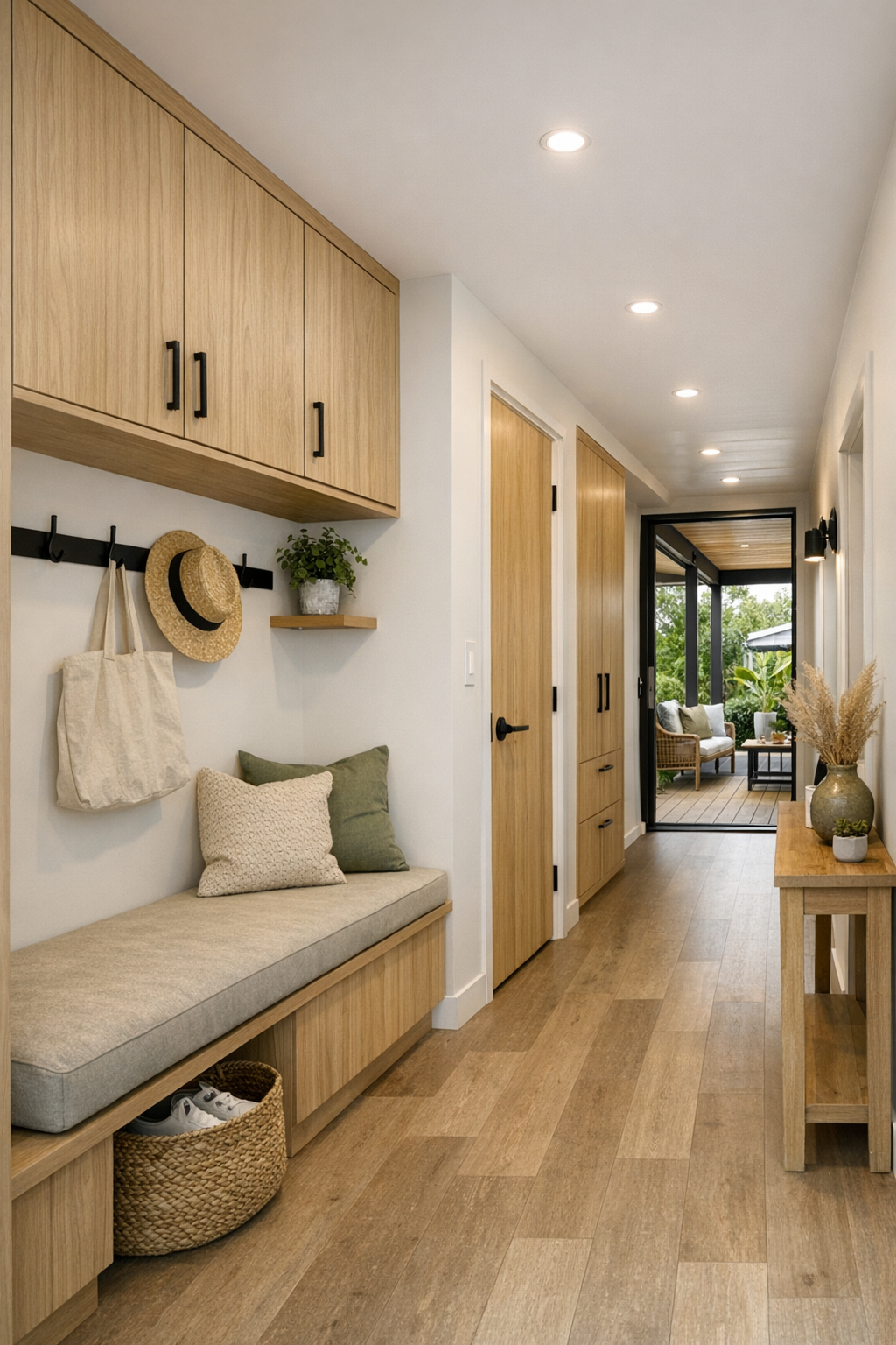
Beyond the main rooms, the home continues to make smart use of every square foot. A compact entry zone includes a built-in bench, coat storage, and easy-to-reach shelving that makes daily comings and goings feel orderly rather than cramped. Hallways are kept wider than expected, which changes the whole experience of moving through the home; instead of simply connecting rooms, they become light-filled transitional spaces with art ledges, soft wall lighting, and occasional niches for plants or ceramics. If there’s a small office nook or utility zone, it’s folded neatly into the plan with cabinetry that matches the rest of the house.
I’m also taken with the covered outdoor terrace and any flexible bonus space attached to it. Whether it functions as a reading corner, a hobby area, or a spot for casual meals, it extends the home’s relaxed personality without breaking the design language. The same sage, oak, black metal, and warm neutrals appear again, tying everything together. It reminds me of a thoughtfully planned prep kitchen: no wasted movement, no awkward gaps, just a series of spaces that support how people actually live.
Why You'd Live Here
This home succeeds because it never asks you to choose between practicality and pleasure. It offers accessibility that is fully integrated, not visually segregated, within a design that feels fresh, warm, and highly composed. The container structure gives it identity, but the interior softens that framework with natural textures, generous light, and a palette that feels restorative rather than trendy. Every room has been shaped to support ease of movement, daily comfort, and real usefulness.
More than that, it has the kind of coherence I always admire. The materials repeat with purpose, the storage is thoughtful, and the atmosphere is welcoming from one end of the house to the other. For anyone who wants a modern home with character, clarity, and a deeply livable plan, this sage green container retreat makes a convincing case. It’s stylish, yes, but it’s also smart—and in my book, that’s what gives a home staying power.