This crisp white accessible container home has the kind of clarity I always respond to right away: clean lines, thoughtful circulation, and a calm, light-filled interior that feels larger than its footprint. Set in a simple, open landscape, the house balances the industrial honesty of container construction with a softness that comes from pale wood, warm textiles, and carefully edited furnishings. Although it is a concept design, it reads with such practical intelligence that I can immediately imagine how daily life would unfold here.
What makes it special, to my eye, is not just the architecture but the way accessibility is handled as a design strength rather than a compromise. Wide passages, flush thresholds, generous turning radiuses, and easy visual flow give the whole home an effortless grace. As someone who spends a lot of time thinking about how kitchens and living spaces really work, I appreciate a plan like this one: everything feels intuitive, bright, and deeply usable.
Exterior
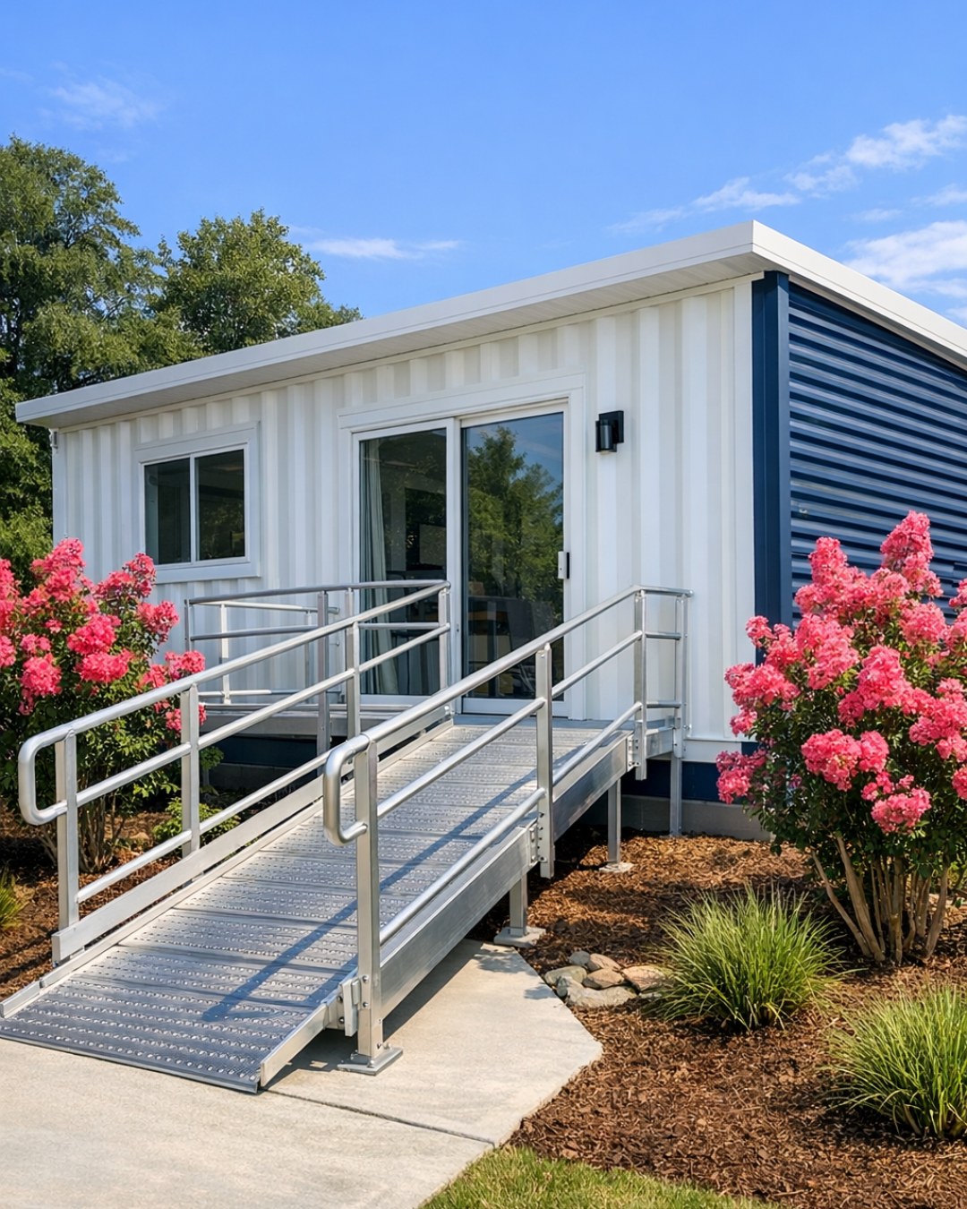
From the outside, the home presents as a composition of crisp white volumes with the unmistakable geometry of shipping containers, but the effect is refined rather than rugged. The white finish cleans up the lines beautifully, while black-framed windows add just enough contrast to sharpen the profile. A low ramp integrated into the entry sequence makes the accessible approach feel natural and architectural, not appended later. I also like the way the massing avoids fussiness; it is straightforward, balanced, and confident.
There is a restrained material palette at work here that lets proportion and light do the heavy lifting. Smooth metal cladding, simple concrete paving, and modest plantings create a modern exterior with very little visual noise. The result feels fresh and organized, almost like a well-composed pantry where every ingredient has its place. Large expanses of glass hint at the openness inside, and the overall mood is bright, practical, and welcoming.
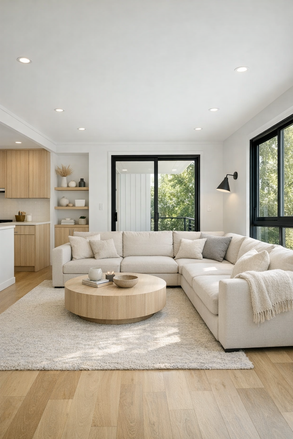
Living Room
The living room is where the interior really begins to show off its special layout. It opens generously without feeling undefined, with wide pathways that make movement easy and furniture placement feel deliberate. A soft neutral sectional, likely in a performance fabric, anchors the room while keeping the palette light. Pale oak flooring warms up the white walls and ceiling, and I can imagine how lovely that wood tone would feel against morning sun or lamplight in the evening.
What I find especially successful is the scale of everything. The seating is low and clean-lined, the coffee table has rounded edges for easier circulation, and built-in storage keeps the room from collecting visual clutter. Layered lighting, including recessed fixtures and a sculptural floor lamp, gives the space flexibility without crowding it. Texturally, it is a smart mix of smooth painted surfaces, nubby upholstery, woven accents, and perhaps a flatweave rug that adds softness without becoming an obstacle underfoot.
Dining Room
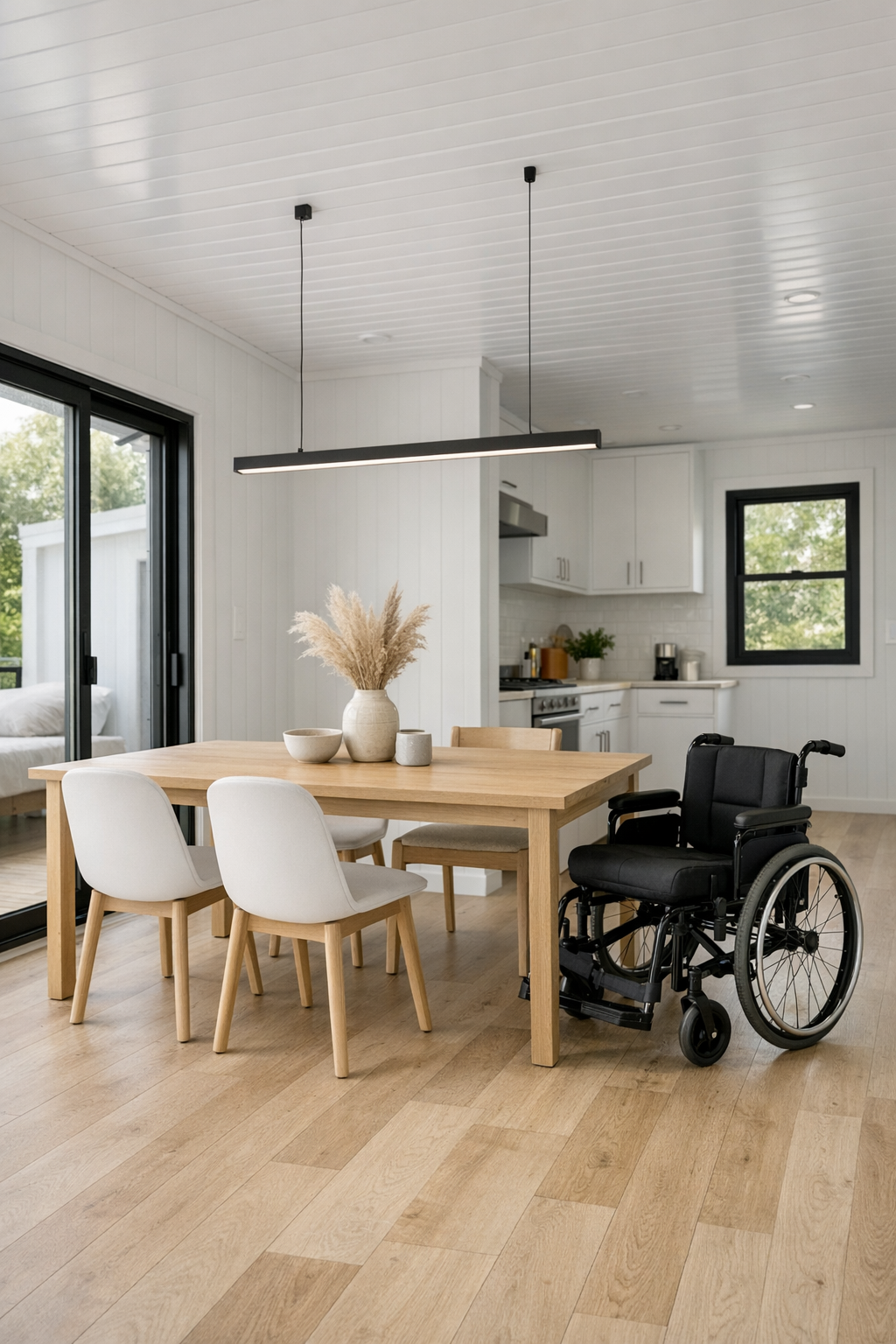
The dining area benefits from the same open planning, but it has enough definition to feel like its own destination. A rectangular dining table in light wood sits comfortably within broad circulation space, with chairs that are slim enough to keep the room airy but substantial enough to feel grounded. I would expect a matte finish on the table, something durable and understated, the sort of surface that can handle everyday meals just as gracefully as a more elaborate dinner.
Above the table, a simple linear pendant likely provides structure and rhythm, while nearby windows keep the space lively and sunlit. The palette stays coherent with the rest of the home: whites, warm wood, soft gray, and a few black accents for outline and contrast. It is a dining room that does not rely on ornament to make its point. Instead, it leans on proportion, comfort, and the pleasure of a room where people can gather easily without bumping elbows or navigating around obstacles.
Kitchen
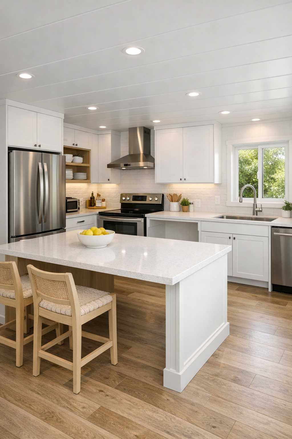
As an experienced cook, I always go straight to the kitchen, and this one is exceptionally well considered. The cabinetry appears streamlined and handle-light, likely in a satin white or very pale warm gray, with open counter runs that make prep work feel generous. Accessibility here is part of the elegance: wide work aisles, easy-to-reach storage, and a layout that allows multiple approaches to key tasks. A large island or peninsula becomes both a workhorse and a social hinge, which is exactly what I want in a home that values everyday ease.
Materially, I can imagine quartz countertops with a soft veining pattern, a full-height backsplash for continuity, and perhaps light wood shelving or accents to keep the room from feeling clinical. Good kitchens, much like good recipes, depend on balance, and this one gets that right. Stainless appliances bring utility, under-cabinet lighting adds precision, and the overall brightness makes everything feel freshly washed and ready for use. It is the kind of kitchen where cooking would not feel squeezed into the plan; it would feel central to it.
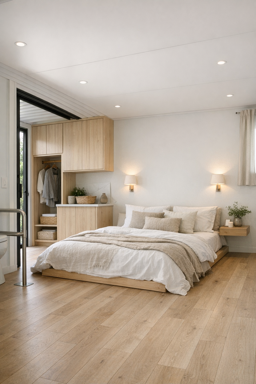
Bedroom
The bedroom takes the home's overall restraint and turns it into something especially restful. A low-profile bed, dressed in layered white and oatmeal linens, likely sits against a simple wall with integrated sconces or pendant lights to keep surfaces uncluttered. The room does not need much to feel complete; the architecture and the light carry a great deal of the atmosphere. I imagine blackout window treatments tucked neatly out of sight, preserving the clean lines while making the room practical.
What I like most is the sense of ease. There is ample clearance around the bed, storage is likely built in rather than bulky, and every choice appears aimed at quiet comfort. Soft textiles, pale wood, and maybe a subtle wool rug bring enough texture to keep the room from feeling stark. In a home with this much visual discipline, the bedroom becomes a welcome exhale, the place where the minimal palette finally reads as deeply cozy rather than merely neat.
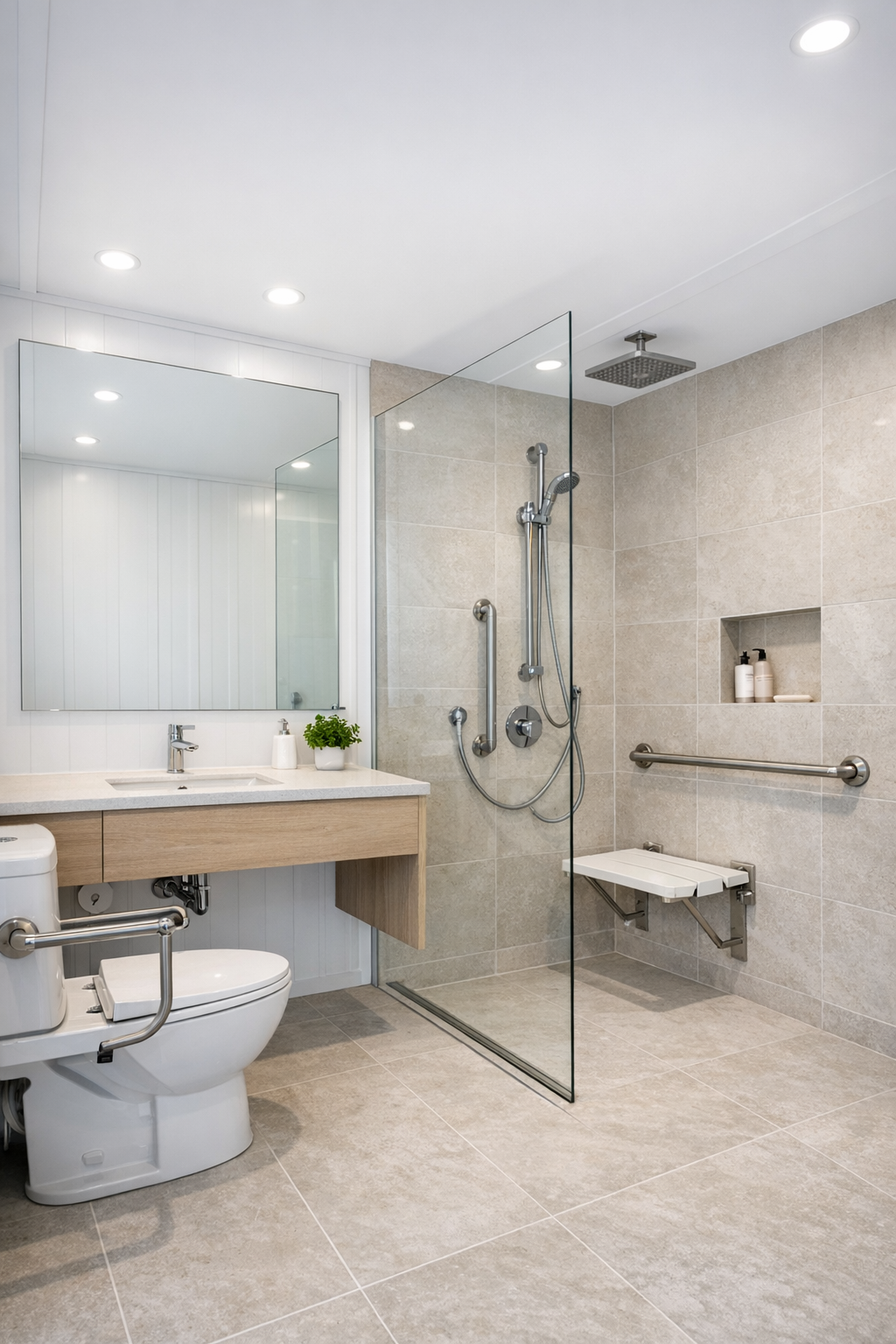
Bathroom
The bathroom is one of the strongest expressions of the home's accessible design language. A curbless shower, likely framed with clear glass, keeps the room visually open while making entry effortless. Large-format tile in a soft stone tone reduces grout lines and adds a sense of expansiveness, and a floating vanity helps the floor plane read continuously. These are decisions that improve both appearance and usability, which is always my favorite kind of design move.
Fixtures would be best kept simple and high quality: matte black or brushed nickel, a broad mirror to bounce light, and recessed niches that spare the room from clutter. Good bathroom design often comes down to cleanliness of line, and this one seems to understand that completely. Even the lighting feels considered, with enough brightness for daily routines but a softness in finish and color temperature that keeps the room from feeling sterile. It is practical, polished, and easy to imagine using comfortably every single day.
Other Areas
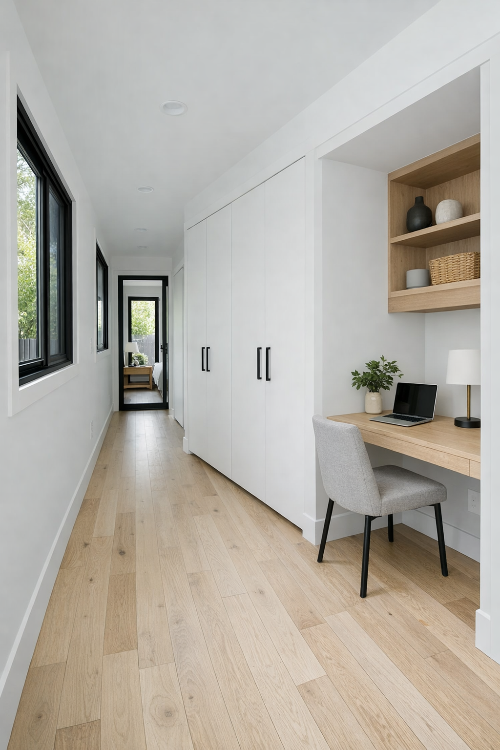
What rounds out the home is the connective tissue: the hallway transitions, entry moments, and any flex nook or built-in workstation that the plan can accommodate. In a container home, those in-between spaces matter tremendously because they can either feel constrained or beautifully efficient. Here, they seem resolved with real care. Corridors are wide enough to feel generous, storage is integrated into the architecture, and the visual continuity of white walls and pale flooring keeps everything flowing.
I can also imagine a modest laundry zone, perhaps concealed behind flat-panel doors, and a compact work area with a simple desk tucked near a window. These are the kinds of details that make a small home live larger. Every inch appears to have purpose, but not in an overworked way. Instead, the home feels edited, much like a well-run kitchen where tools are exactly where you need them and nowhere they should not be.
Why You'd Live Here
You would live here because it proves that compact, accessible design can be deeply beautiful. The home is efficient without feeling tight, modern without feeling cold, and minimal without becoming severe. I admire how every design decision seems to support daily life, from the broad circulation to the durable finishes to the calm, coherent palette. It is a house that understands that ease can be luxurious.
More than anything, this home offers a sense of order that feels restorative. It would suit someone who values simplicity, light, and a layout that works as hard as it looks good. For me, the kitchen alone would be a draw, but the real success is how the entire home functions as one seamless experience. It is crisp, welcoming, and unusually well resolved from the first approach to the final quiet corner.