This dusty rose accessible container home feels like the kind of place that immediately lowers your shoulders the second you step near it. Set in a quiet, open suburban landscape that I picture somewhere with wide skies and a little breeze moving through ornamental grasses, it blends a soft, welcoming color palette with the crisp geometry of repurposed steel. What makes it so memorable is the way it turns an industrial shell into something genuinely warm and livable, with barrier-free planning, gentle curves, and sunlight doing a lot of the heavy lifting.
As a concept design, it also manages to feel surprisingly practical, which is probably why I kept imagining real life unfolding here: grocery bags rolling in easily, dinner simmering while the windows catch the late afternoon glow, and every room working hard without looking overly “designed.” There’s a calm confidence to the whole home, from the muted rosy exterior to the layered natural textures inside, and it strikes that sweet spot between modern minimalism and everyday comfort.
Exterior
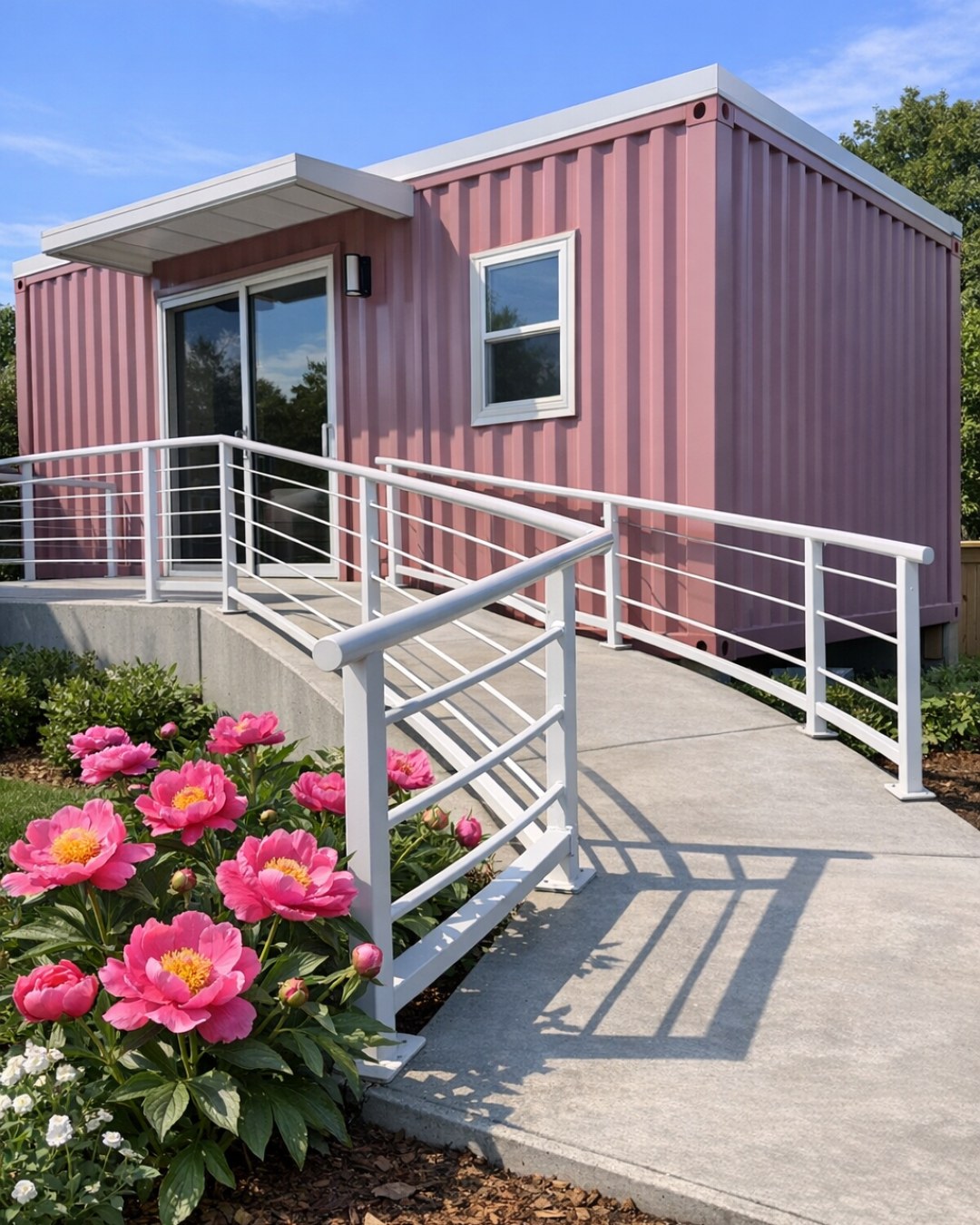
From the outside, the home keeps the unmistakable linear profile of container architecture, but the dusty rose finish softens every edge. Instead of feeling stark or utilitarian, the matte cladding reads almost like sun-faded clay, especially when paired with black-framed low-threshold glazing and pale concrete walkways. A broad ramp is integrated right into the entry sequence rather than added as an afterthought, and I love how that choice makes the façade feel intentional and elegant. Slim planter beds with feathery grasses, rosemary, and low native shrubs bring movement against the structured form.
The overall composition is clean and grounded, with a flat roofline, deep overhangs, and thoughtfully placed windows that protect privacy while still pulling in plenty of light. Warm wood soffits and vertical slatted privacy screens break up the metal envelope and keep it from feeling too hard. It has that polished, edited look I always appreciate in a home tour, but it also feels manageable, like the exterior materials were chosen for real life and low maintenance, not just for a pretty photo.
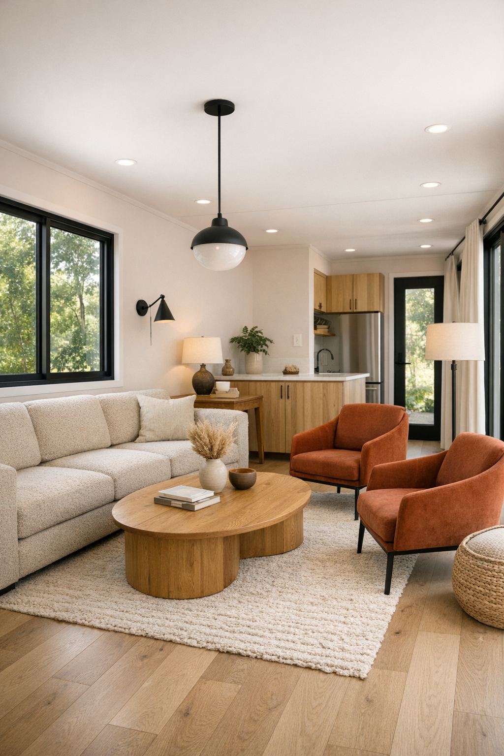
Living Room
The living room is where the home really starts to reveal its softer side. White oak flooring runs throughout in a pale matte finish, visually widening the space, while the walls stay a warm off-white with the faintest pink undertone to echo the exterior. A low-profile modular sofa in oatmeal boucle anchors the room without blocking circulation, and there’s generous clearance all around it, which keeps the accessible layout feeling effortless instead of clinical. A rounded oak coffee table, a pair of rust-toned accent chairs, and woven storage pieces add shape and warmth in a room that could otherwise lean too linear.
What I notice most is the light. Floor-to-ceiling windows pull daylight across the textured rug and bounce it off limewashed surfaces, making the whole room glow in a way that feels cozy even though the palette is restrained. Layered lighting keeps it functional after dark: a recessed track for overall illumination, a sculptural floor lamp by the reading corner, and discreet wall washers that emphasize the long architecture. If I were balancing work emails and getting dinner started, this is exactly the kind of room where I’d want to pause for ten minutes with a cup of coffee before the evening rush.
Dining Room
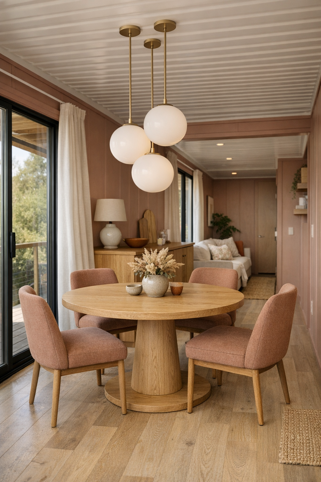
The dining area sits in an open but clearly defined zone between the living space and kitchen, and the flow is one of its strongest features. A round pedestal table in light oak makes movement easier and feels especially smart here, with no sharp corners interrupting the path around it. Upholstered dining chairs in a muted clay fabric bring in another hit of softness, while their supportive, slightly curved backs make the space feel inviting enough for a long weeknight dinner or a lazy Sunday breakfast.
Above the table, a trio of small opal glass pendants hangs at staggered heights, giving the room a gentle glow without overwhelming the low, horizontal architecture. One wall features a built-in sideboard in rift-sawn oak with integrated finger pulls, and I can absolutely imagine it working overtime for both daily dishes and holiday serving pieces. The styling stays simple with handmade ceramics, a linen runner, and a branchy arrangement in a matte vessel, which keeps the room polished but still easygoing.
Kitchen
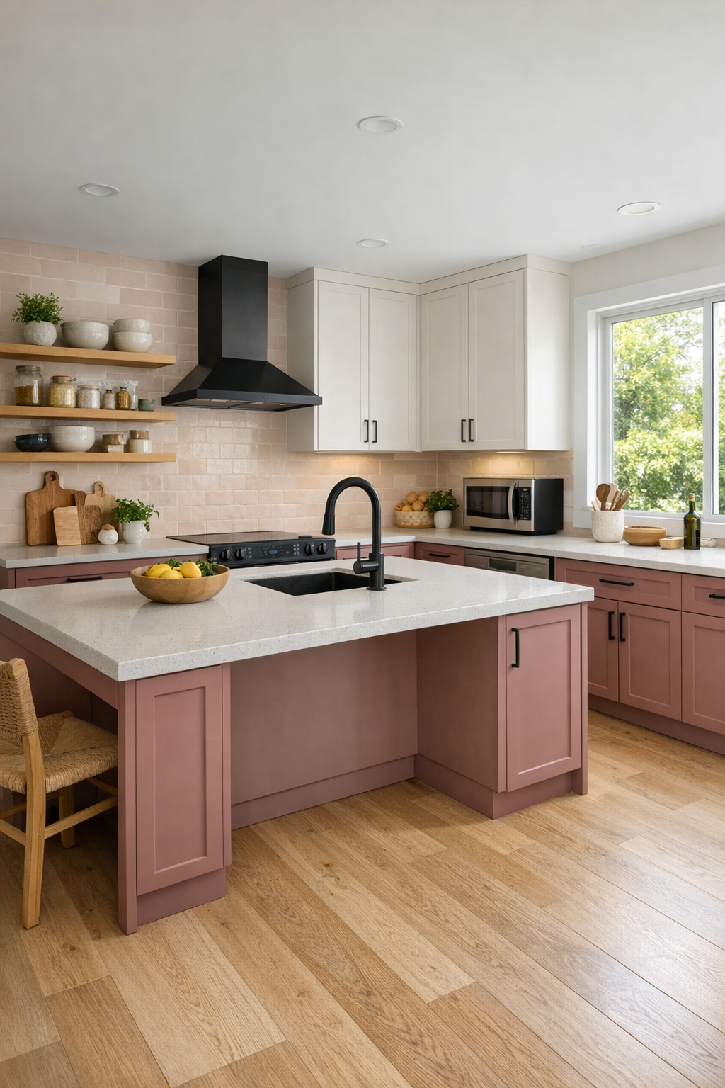
The kitchen is, honestly, my favorite part, probably because it feels designed for someone who genuinely cooks instead of just reheating things under pretty lights. The cabinetry is a mix of flat-panel dusty rose lowers and warm white uppers, balanced by white oak open shelving and a pale quartz countertop with a softly eased edge. There’s ample knee space at the island, wide circulation paths, and hardware that’s easy to grip, all integrated so naturally that the room never loses its streamlined look. A full-height pantry wall keeps visual clutter down, which, as someone who is always trying to stay on top of meal prep containers and weeknight ingredients, I deeply appreciate.
The backsplash is a satin ceramic tile in a creamy blush tone laid in a stacked pattern, giving just enough texture to catch the light. Under-cabinet lighting makes prep work practical, while a large picture window over the sink turns even routine cleanup into something brighter and calmer. The appliances are paneled where possible, with matte black accents tying in the window frames and plumbing fixtures. It’s efficient without being cold, and I can already picture a pot of soup on the cooktop, produce spread out across the island, and everything within easy reach.
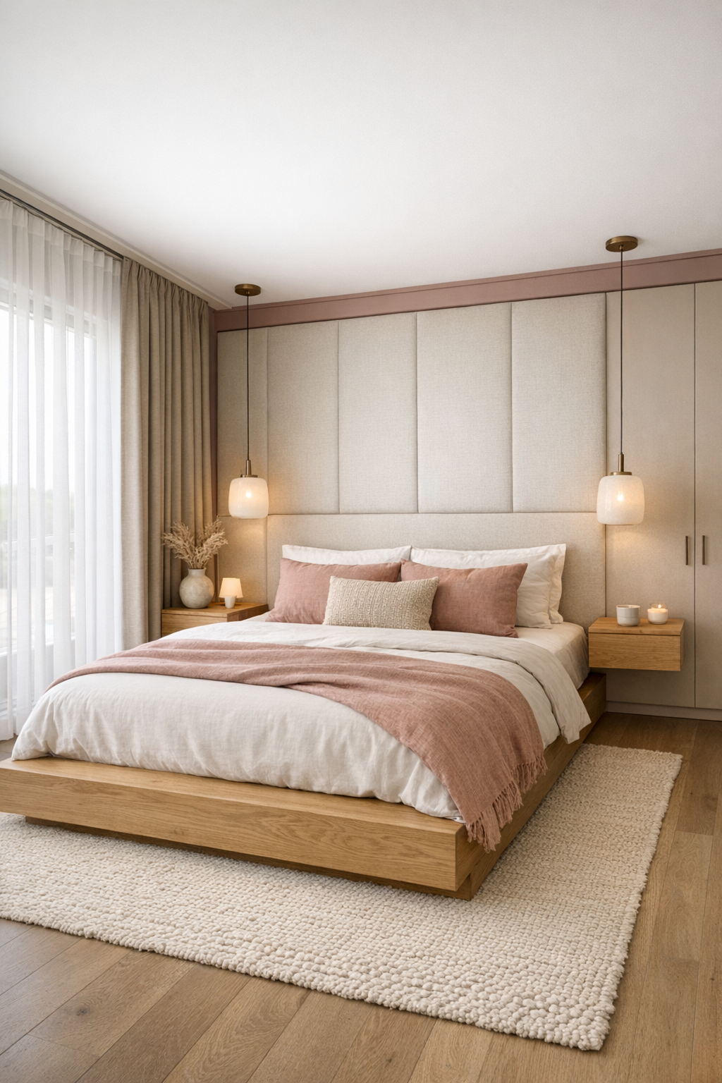
Bedroom
The bedroom takes the home’s gentle palette and turns it even quieter. A low platform bed in light oak sits against a softly upholstered headboard wall in a warm neutral fabric, while dusty rose linen pillows tie back to the exterior in a way that feels subtle rather than themed. The circulation space around the bed is generous, and the furniture stays intentionally edited: floating nightstands, a slim reading chair near the window, and built-in wardrobes with flush fronts that disappear into the wall plane.
Texture does most of the decorative work here. There’s a nubby wool throw at the foot of the bed, woven blackout drapery layered with sheer panels, and a large area rug that softens the floor underfoot without adding visual heaviness. Lighting is especially thoughtful, with dimmable cove lighting, adjustable bedside sconces, and soft ambient illumination that makes the room feel restorative at the end of a long day. It’s one of those bedrooms that doesn’t beg for attention; it just quietly promises good sleep.
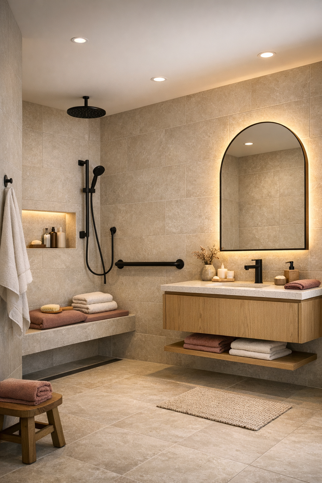
Bathroom
The bathroom is a beautiful example of how accessibility and spa-like design can absolutely coexist. A curbless shower extends seamlessly from the main floor with large-format porcelain tile in a pale limestone finish, and a built-in bench in matching material keeps the look unified. The vanity is wall-mounted in white oak with wide drawers, easy-to-reach storage, and a quartz top that continues the clean, bright material story from the kitchen. Matte black fittings give just enough definition without making the room feel high contrast or harsh.
What keeps this space from feeling too minimal is the layering of softer details: an arched mirror, plush ribbed towels, a small stool in sealed teak, and warm indirect lighting tucked behind the mirror and beneath the vanity. The palette stays creamy, mineral, and calm, with dusty rose introduced only in tiny touches through accessories and reflected tones. It feels hygienic and easy to maintain, but not sterile, which is a line I think a lot of modern bathrooms struggle to walk.
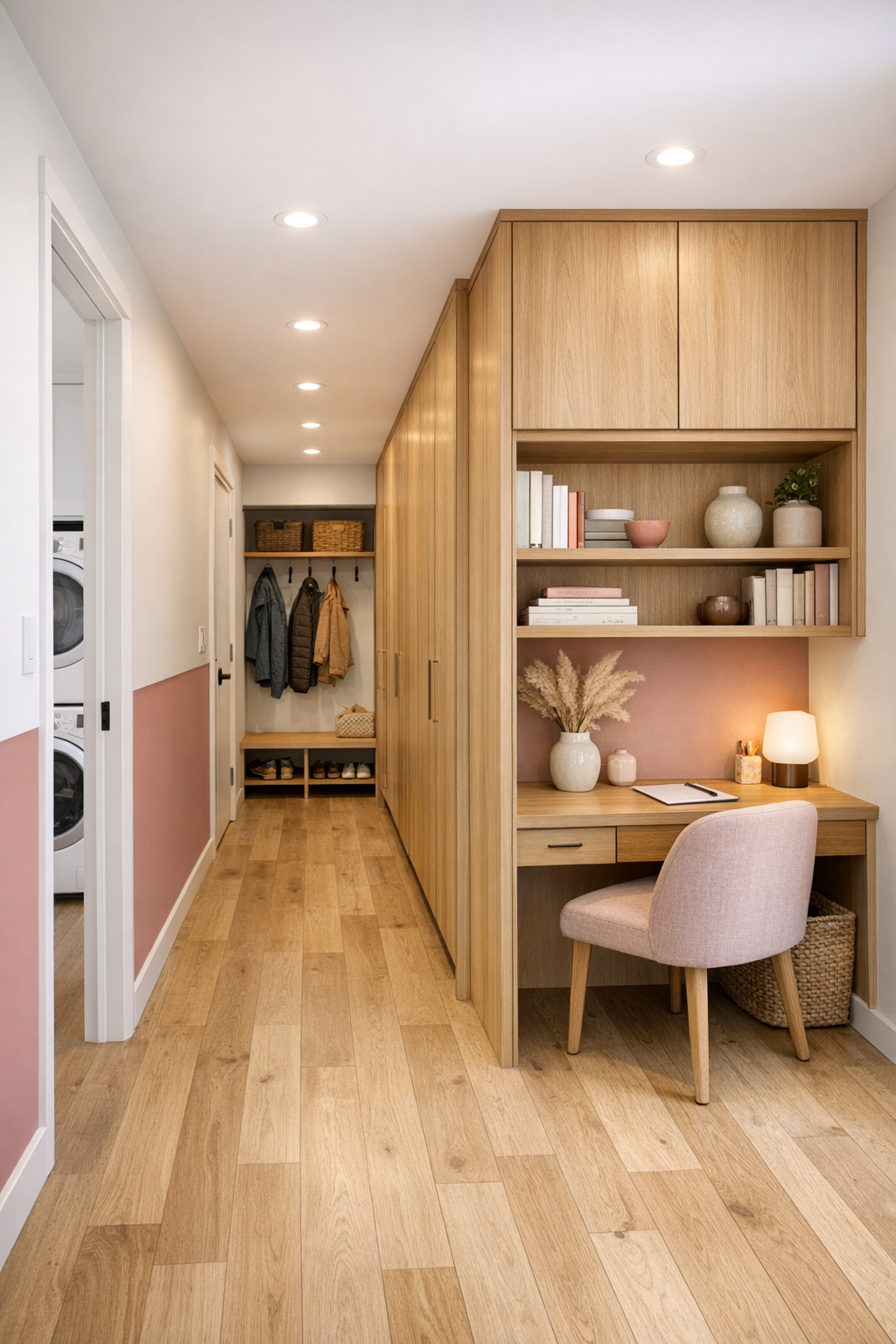
Other Areas
The secondary spaces are where this home proves just how thoughtfully it has been planned. A compact entry zone includes a built-in bench, open cubbies, and a full-height storage closet, all finished in the same oak and warm white palette so the practical pieces feel seamless. The hallway is wider than expected, with softly lit art niches and continuous flooring that keeps the home feeling cohesive. There’s also a small flex nook with a desk surface and open shelving, and I immediately thought of recipe printouts, a laptop, and the kind of catch-all tasks that happen between real life and home life.
If this were my space, I’d probably spend an embarrassing amount of time appreciating the laundry area too, because it’s actually pleasant to look at. Stacked appliances are tucked behind pocket doors, with a folding counter above pullout hampers and room for easy access. Even the outdoor connection feels like part of the interior story, thanks to a covered terrace just beyond the main living zone, furnished simply with sling seating, a dining table, and potted herbs near the threshold. Every inch feels considered, but nothing feels fussy.
Why You'd Live Here
You’d live here because it takes a format that can sometimes feel rigid and makes it feel deeply human. The accessible planning is integrated into every decision, from circulation to furniture placement to hardware choices, but it never overshadows the beauty of the interiors. Instead, the design leans into soft color, natural materials, and light-filled rooms that support everyday routines in a graceful, uncomplicated way.
For me, the biggest win is that it feels both aspirational and usable. It’s stylish without being precious, modern without being cold, and organized in a way that would genuinely help a busy household function better. Between the dusty rose palette, the warm oak detailing, and the smart, barrier-free layout, this is the kind of home that doesn’t just photograph well. It feels ready for life.